Aquarium de Paris.
Home.
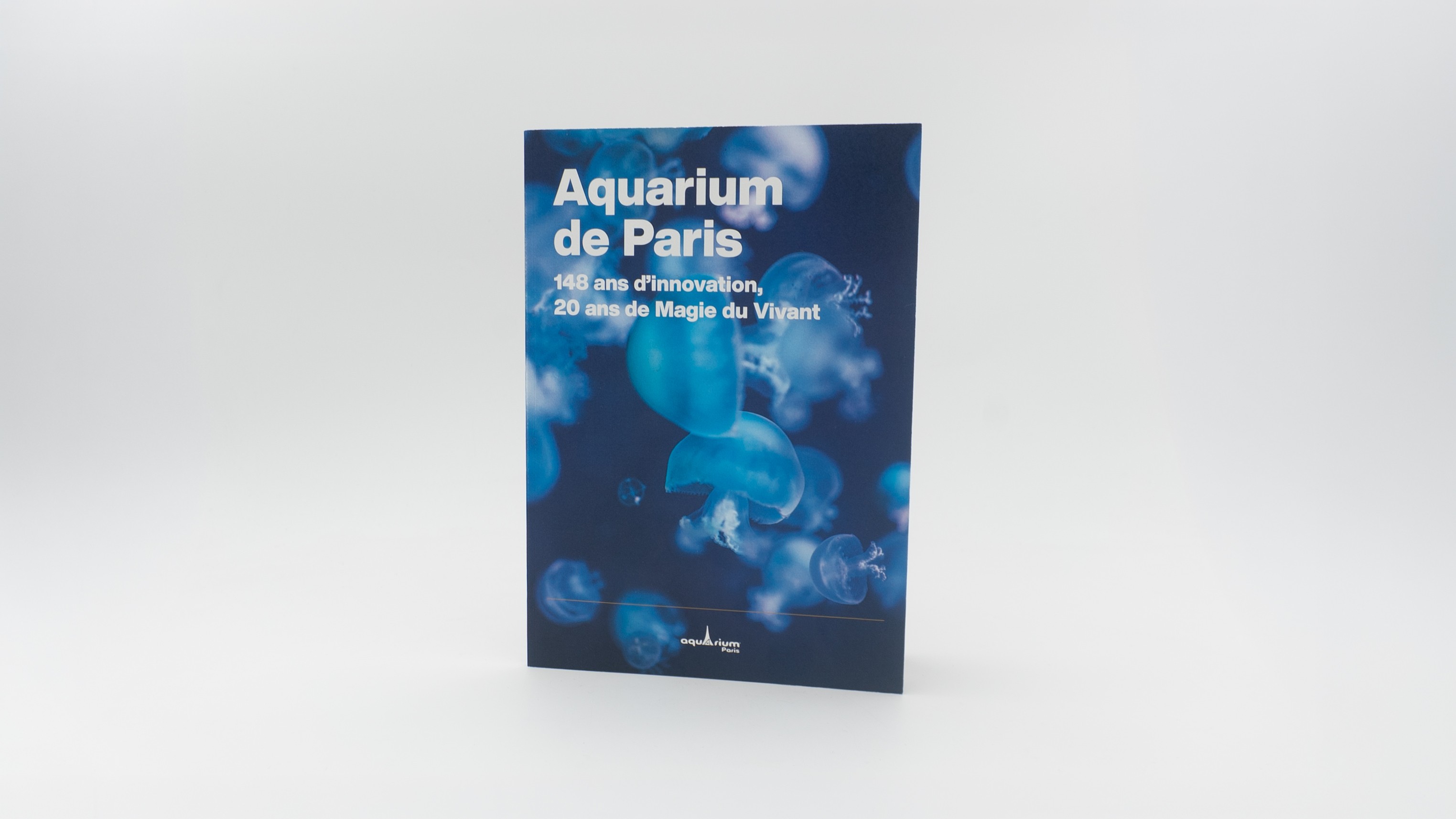
A milestone worth holding. To mark twenty years of the Aquarium de Paris, we created a commemorative book tracing the institution's history designed to be given, kept, and remembered.
Challenge.
The book needed to feel premium enough to serve as a meaningful gift at a landmark event, while staying within a conscious budget. The constraint pushed toward smarter material choices rather than expensive ones.
Creative development.
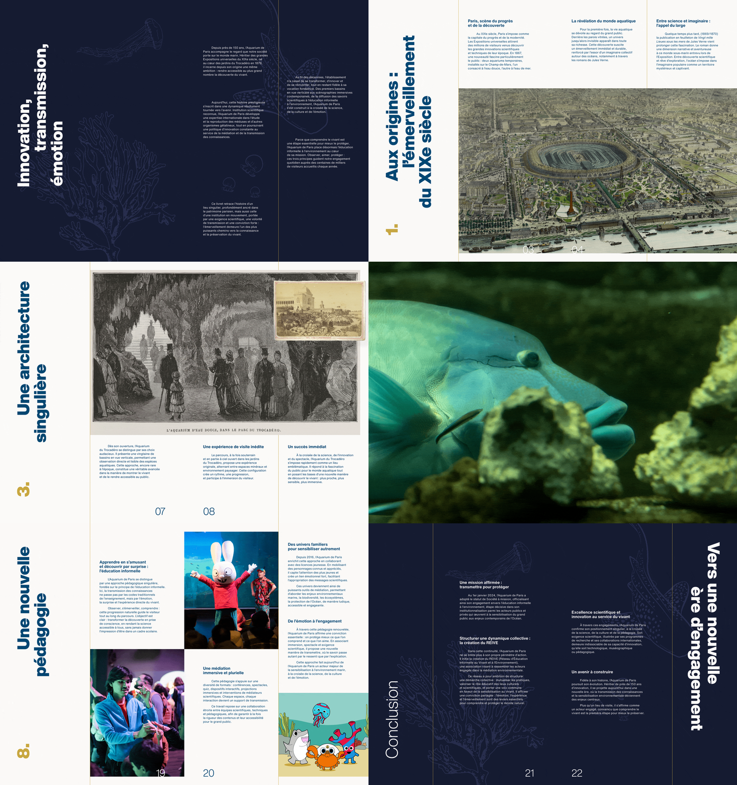
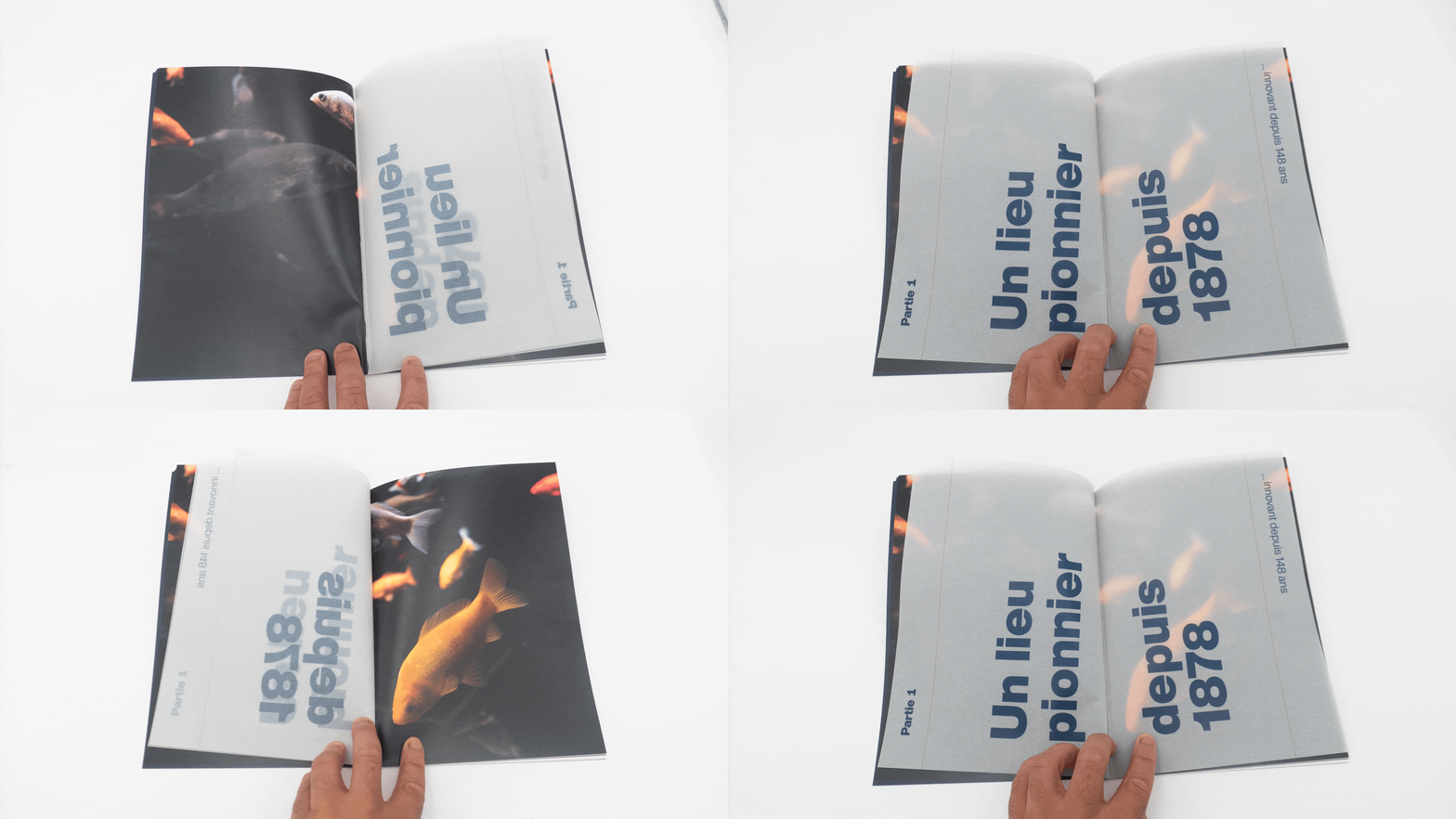
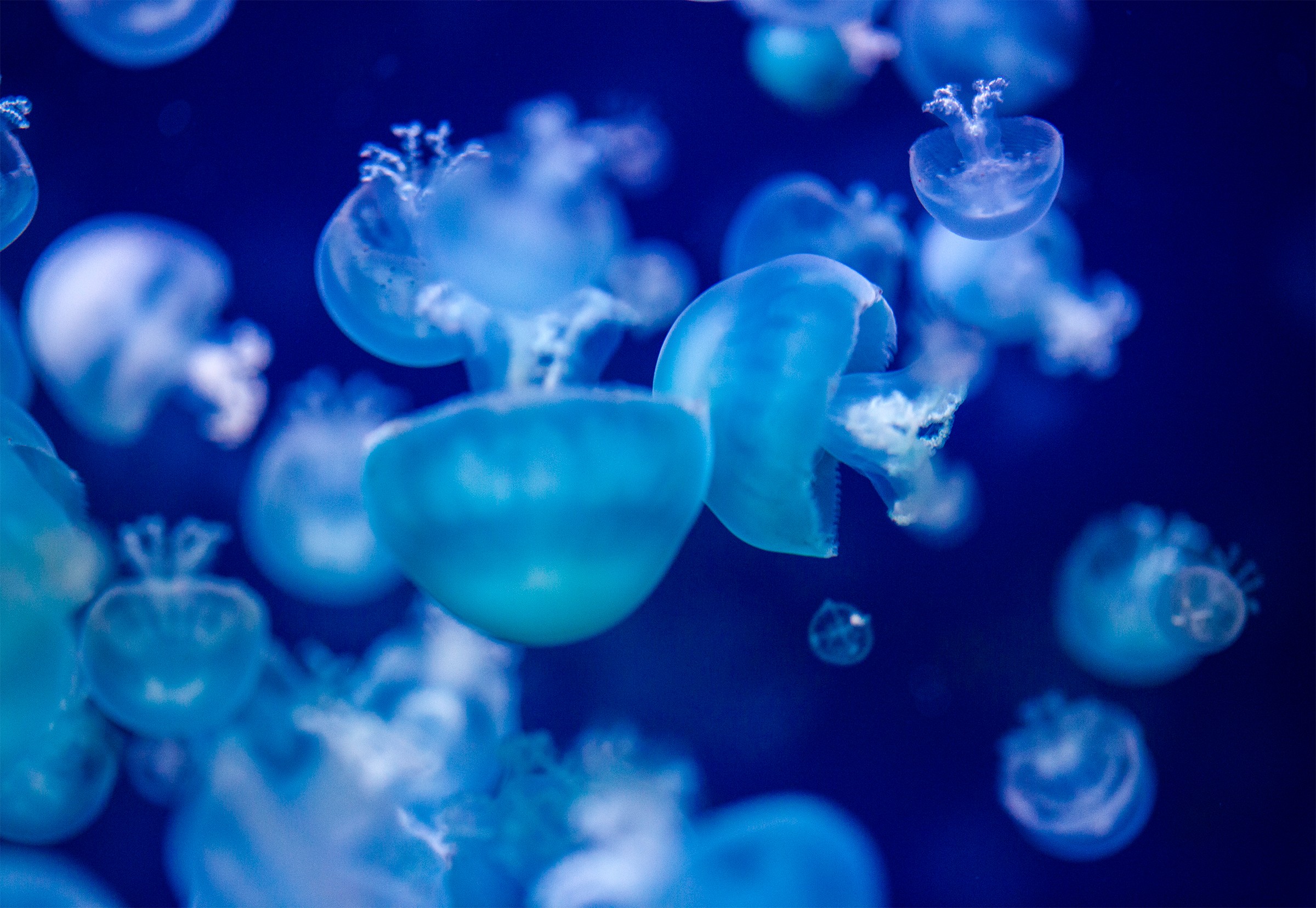
The layout builds on the Aquarium's existing brand elements, refined for a more editorial register. The most considered decision was tactile: section covers printed on tracing paper, creating a translucent interaction with the full-bleed species photography beneath. The effect is quiet and unexpected. The kind of detail that makes a document feel designed rather than produced. Munken paper throughout the body of the book adds a quality feel without the cost of more specialist stocks.
Application.
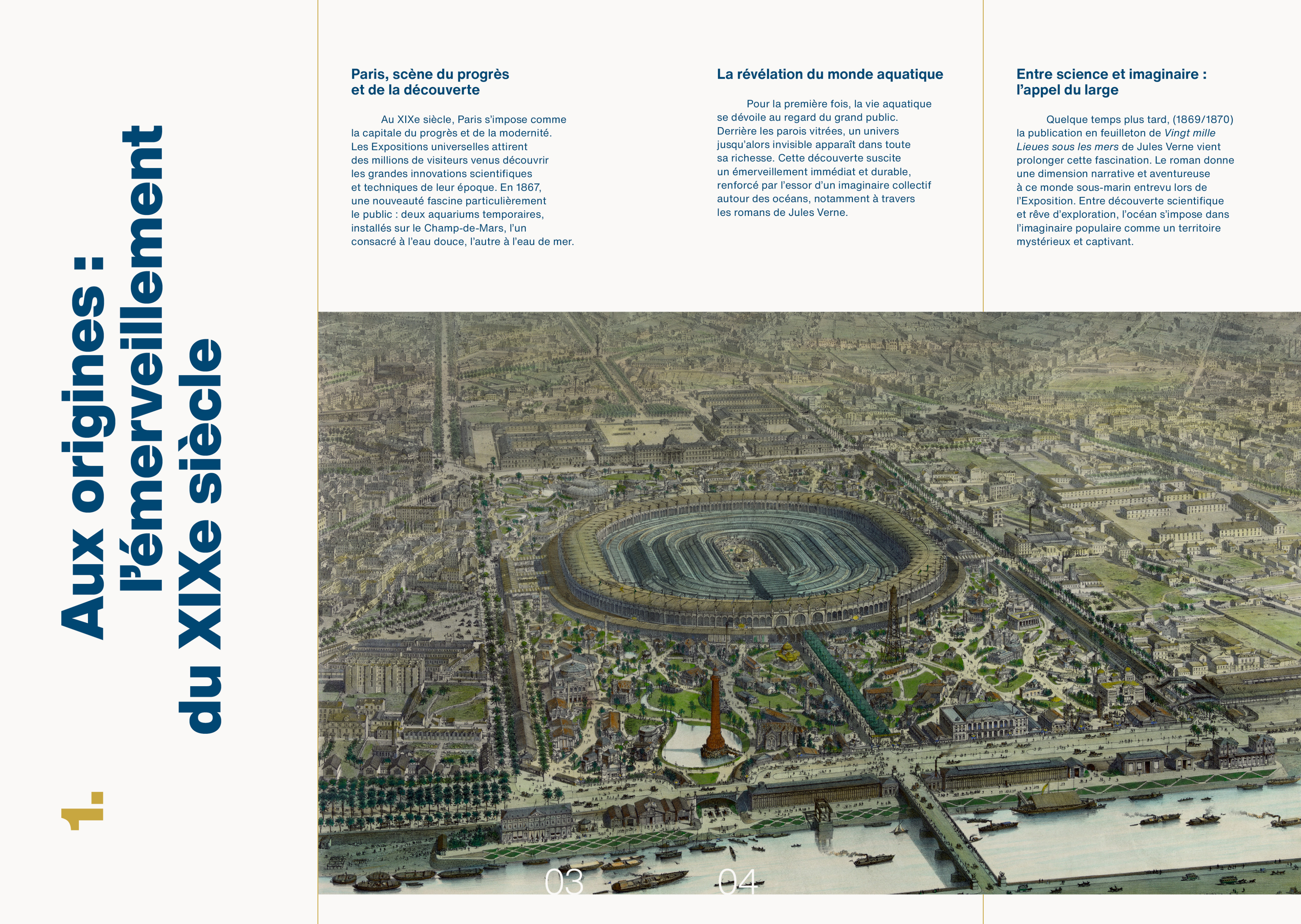
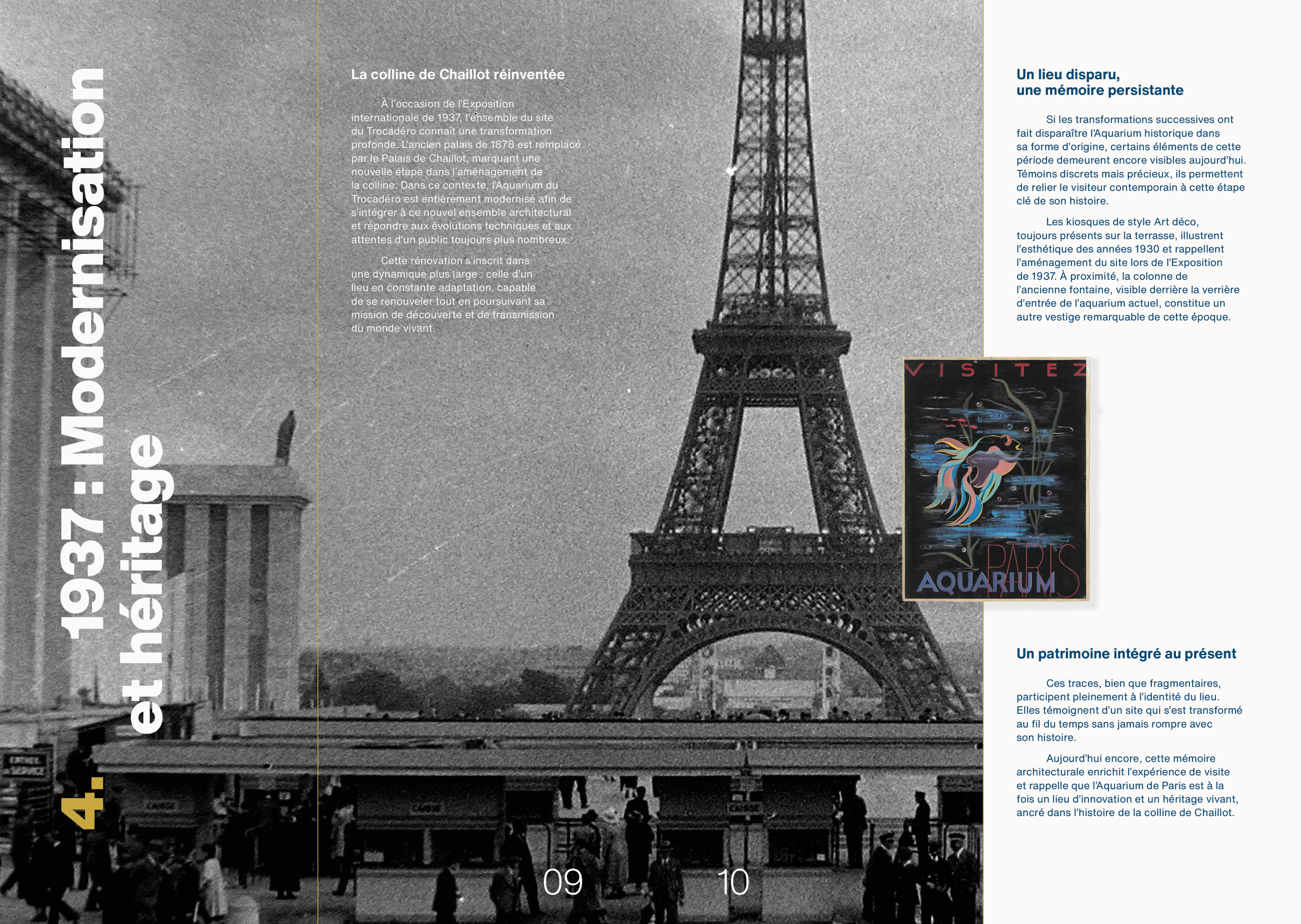
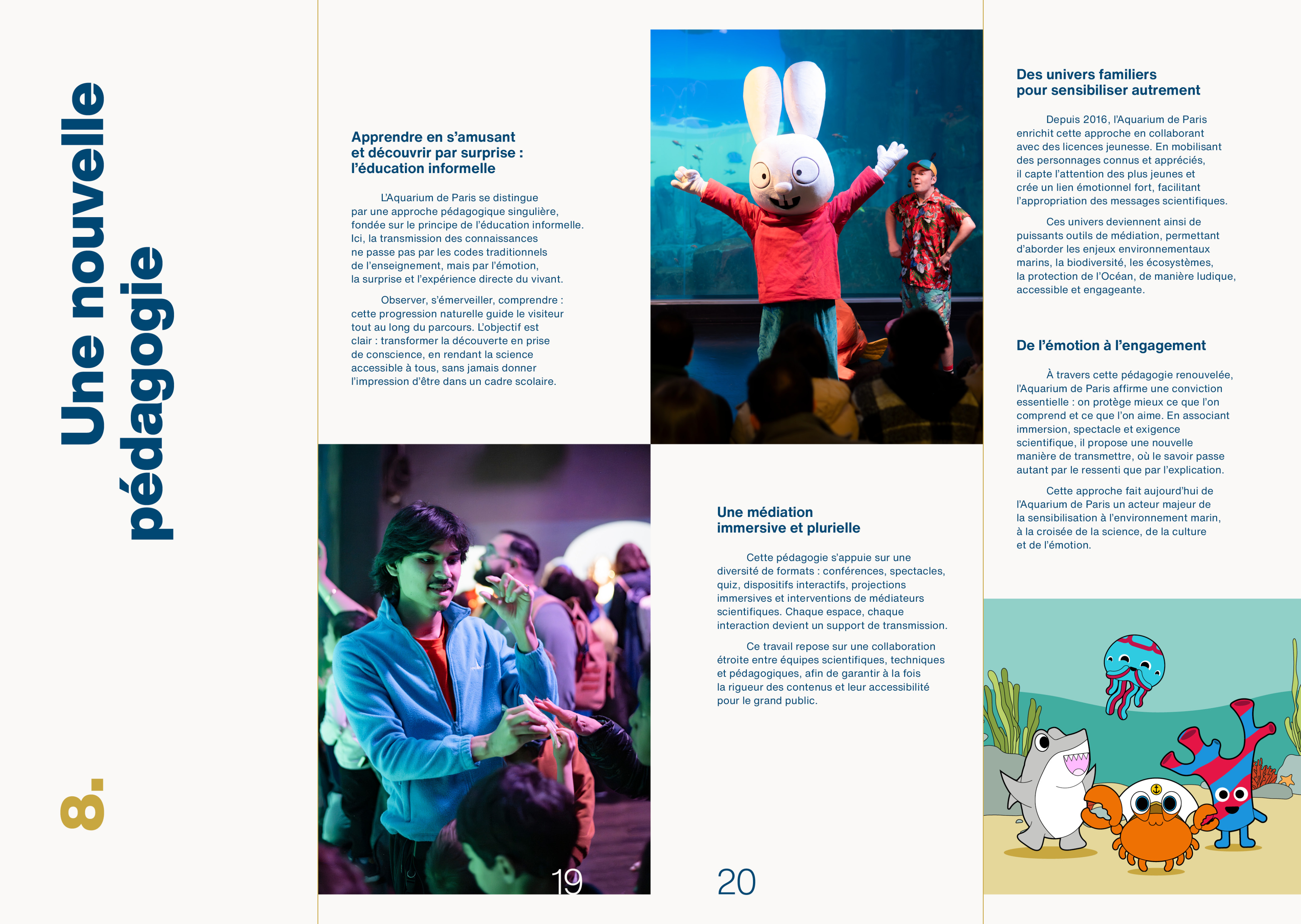
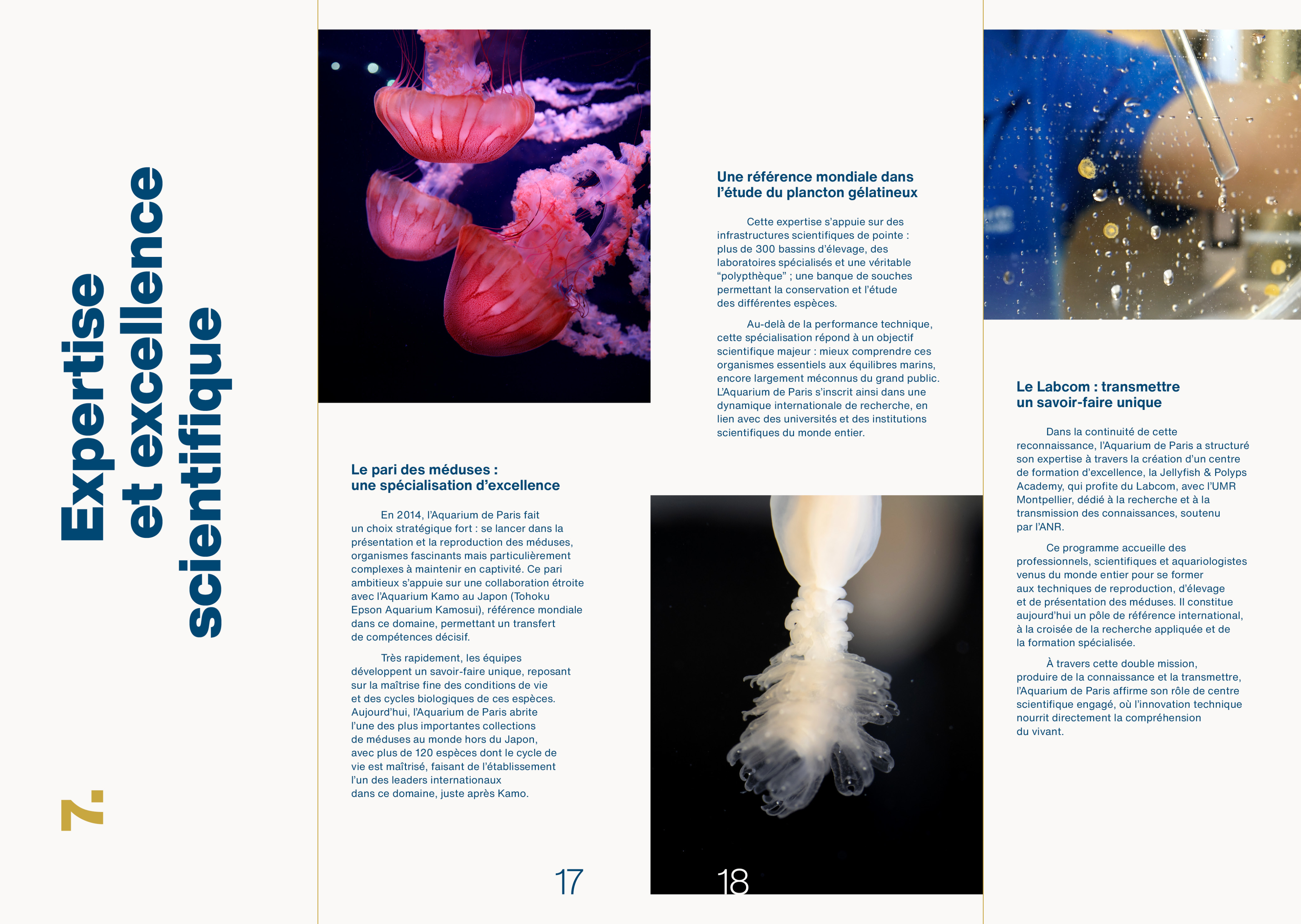
36 pages in B5 format, more considered than A4, more generous than A5. Three types of spreads give the document rhythm: white backgrounds for the main editorial, dark backgrounds for supplementary content, and tracing paper for section covers. The variation keeps the read alive across a short pagination.
Outcome.
The book landed well with guests and internal teams alike. The response was strong enough that the Direction decided to update it for retail and the event team added it as a purchasable option for their clients.
Industry. Culture.
Scope. Art direction, editorial design.
Year. 2025.
Credits. Eduardo Da Forno (photography). Loire Impression (Printmaking).

Aquarium de Paris.
Home.
A milestone worth holding. To mark twenty years of the Aquarium de Paris, we created a commemorative book tracing the institution's history designed to be given, kept, and remembered.
Challenge.
The book needed to feel premium enough to serve as a meaningful gift at a landmark event, while staying within a conscious budget. The constraint pushed toward smarter material choices rather than expensive ones.
Creative development.
The layout builds on the Aquarium's existing brand elements, refined for a more editorial register. The most considered decision was tactile: section covers printed on tracing paper, creating a translucent interaction with the full-bleed species photography beneath. The effect is quiet and unexpected. The kind of detail that makes a document feel designed rather than produced. Munken paper throughout the body of the book adds a quality feel without the cost of more specialist stocks.
Application.
36 pages in B5 format, more considered than A4, more generous than A5. Three types of spreads give the document rhythm: white backgrounds for the main editorial, dark backgrounds for supplementary content, and tracing paper for section covers. The variation keeps the read alive across a short pagination.
Outcome.
The book landed well with guests and internal teams alike. The response was strong enough that the Direction decided to update it for retail and the event team added it as a purchasable option for their clients.
Industry. Culture.
Scope. Art direction, editorial design.
Year. 2025.
Credits. Eduardo Da Forno (photography). Loire Impression (Printmaking).
