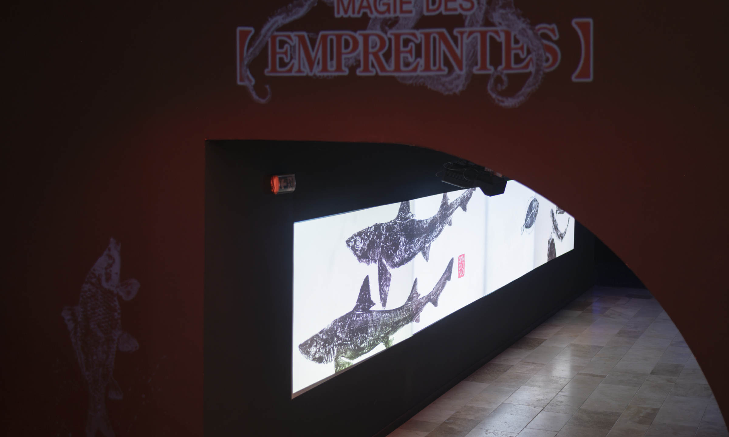
Magie des Empreintes.
Home.

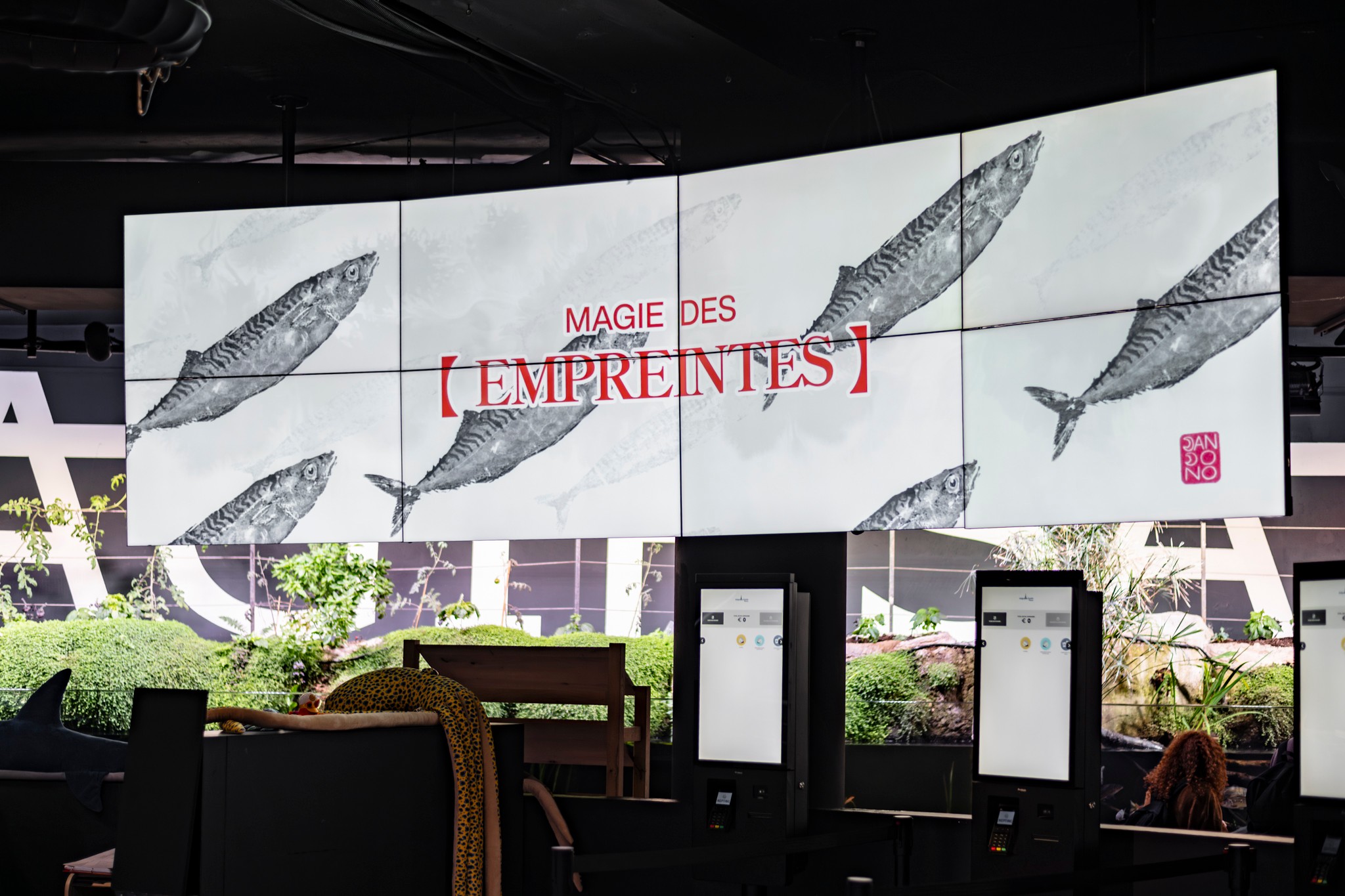
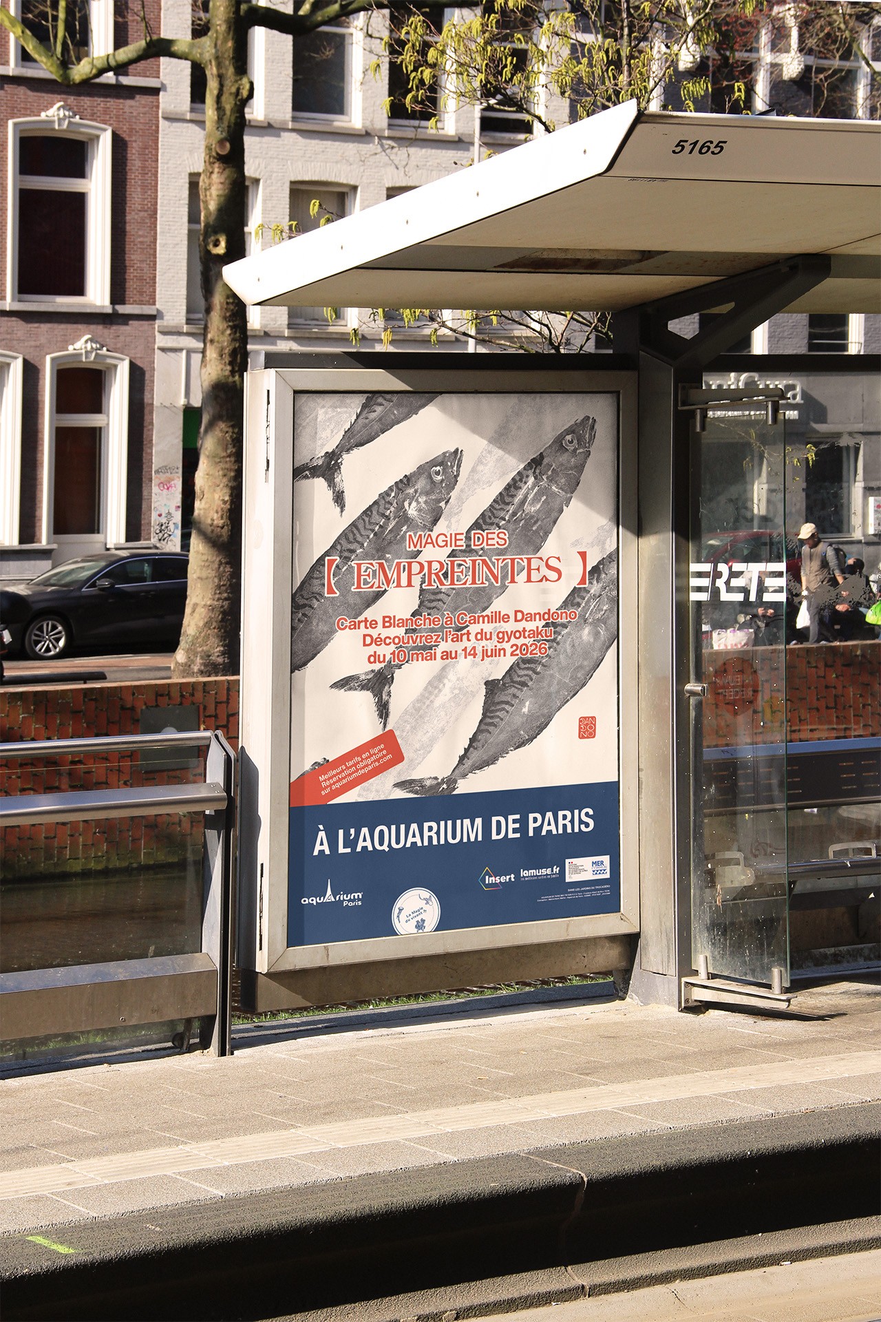
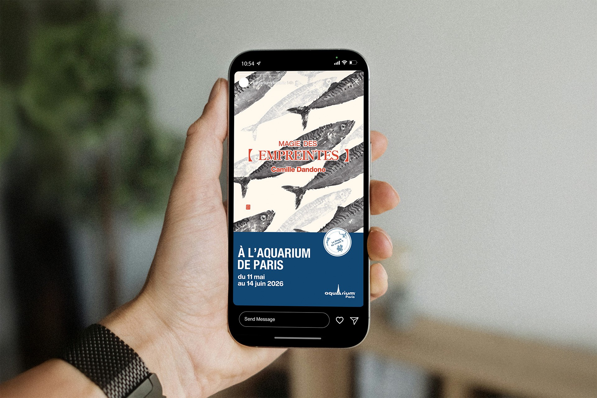
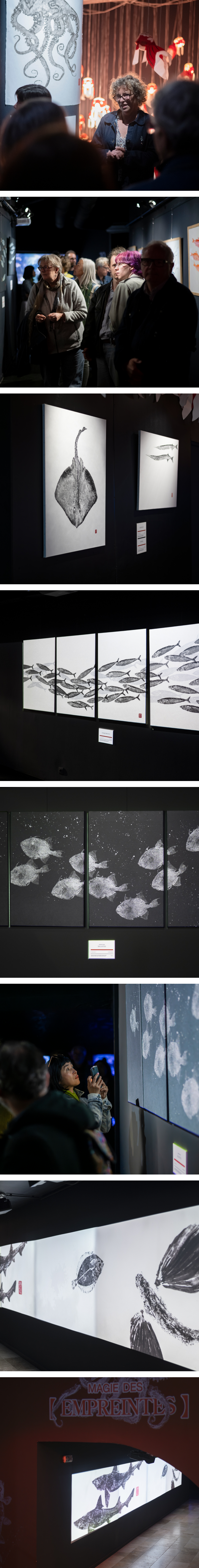
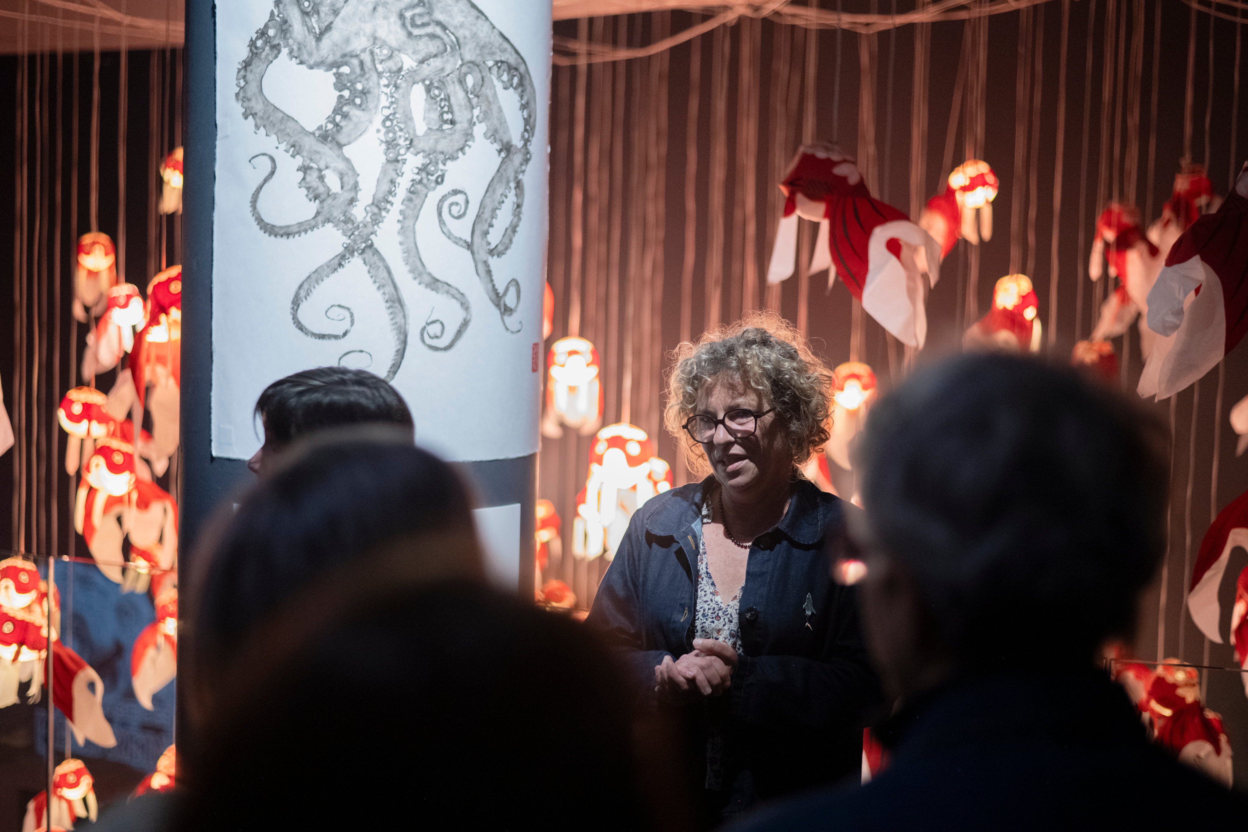
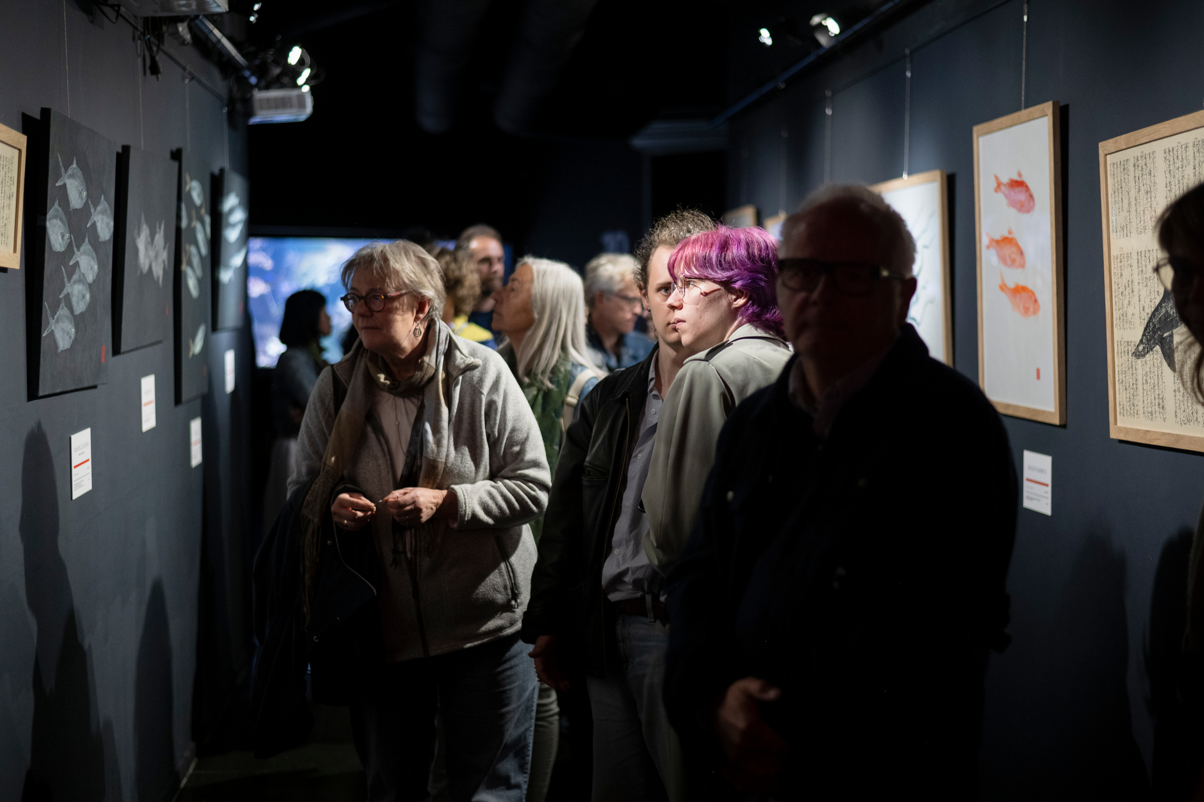
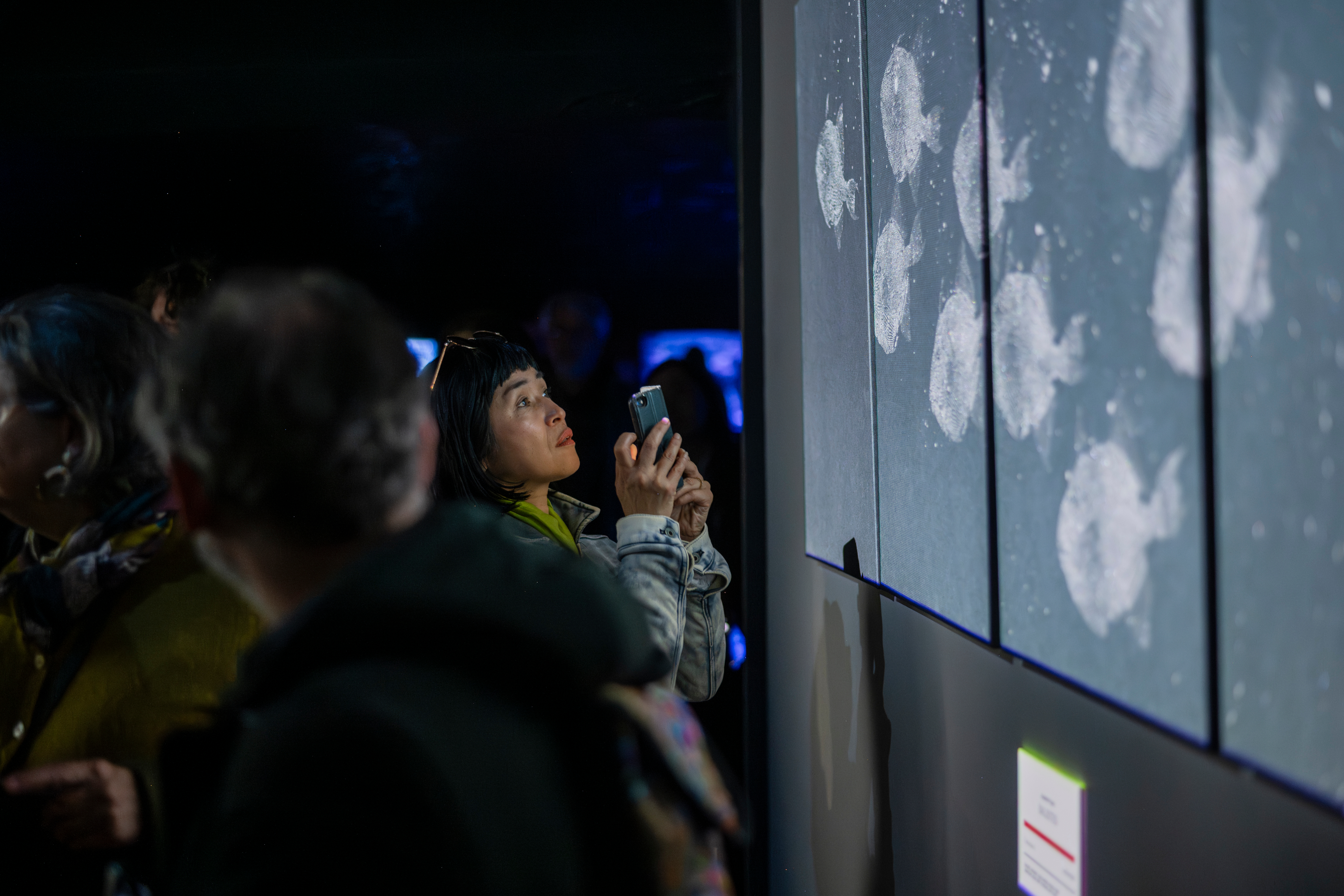
Most people have never heard of gyotaku. That was both the challenge and the opportunity of Camille Dandono’s first Paris exhibition, Magie des Empreintes, held at the Aquarium de Paris. We built an experience that makes an unfamiliar practice feel immediately felt, even before it was understood. Physical prints and projected motion coexisted throughout the space, demanding a visual language that could hold its own across both stillness and movement.
Challenge.
Gyotaku is an ancient Japanese technique of printing directly from fish, largely unknown to Parisian audiences. The challenge was to introduce both the artist and the practice in a way that honored the depth of the tradition without making it feel inaccessible. This was also a personal milestone: their first exhibition in Paris, bringing a Briton artist into the capital for the first time.
Strategy.
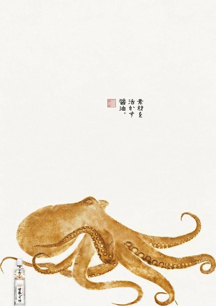
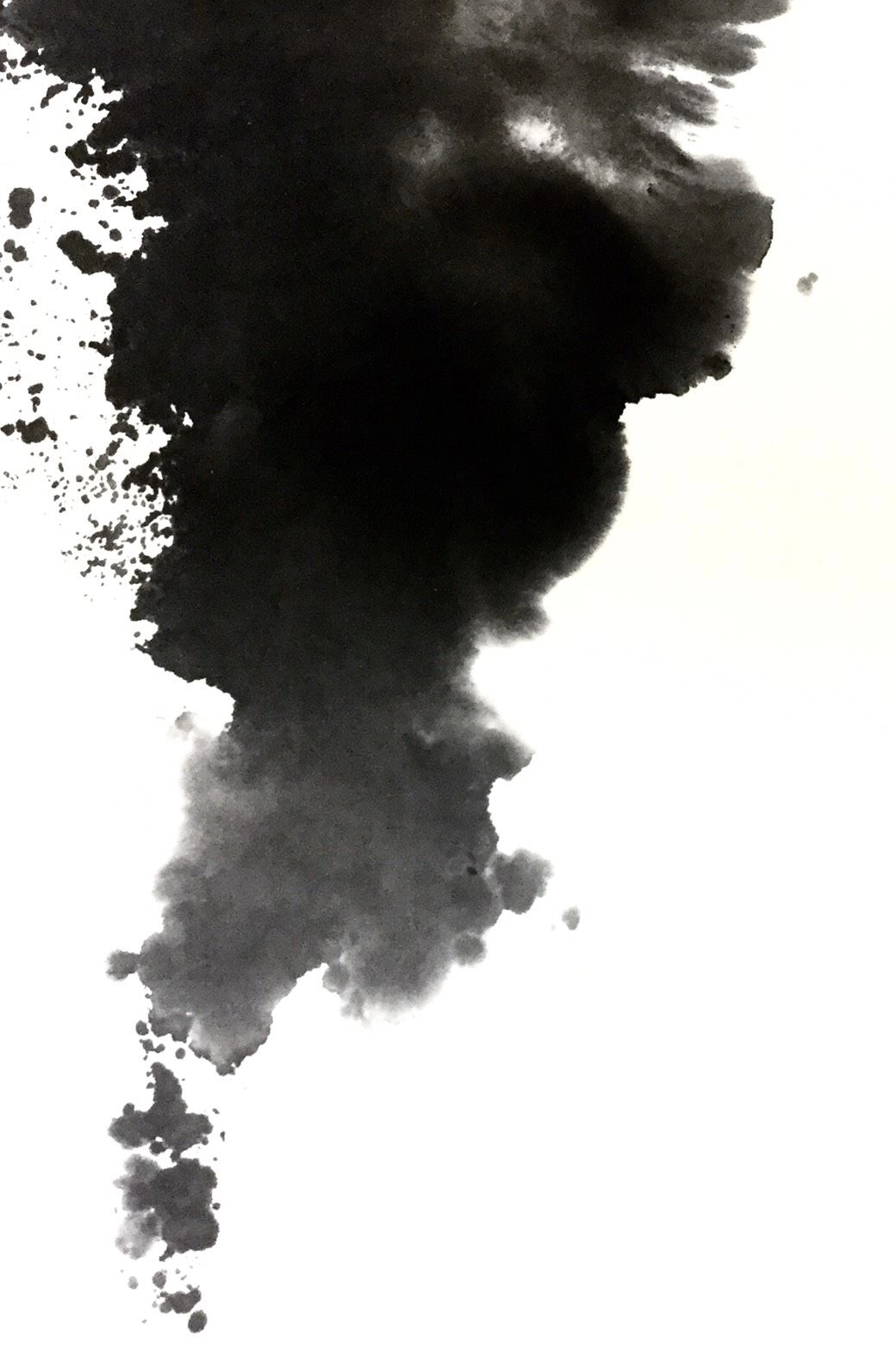
In conversation with the artist, I unveil the meaning of the beneath technique. It is a ritual of memory and connection. Gyotaku connects fishermen to the fish they catch. For the artist, it connects them to their close ones. I built the identity around the idea that every print is an act of remembrance, a way of holding something that can’t be held. To bridge Eastern and Western audiences, I took references from art techniques and design styles that span across both worlds.

Identity.
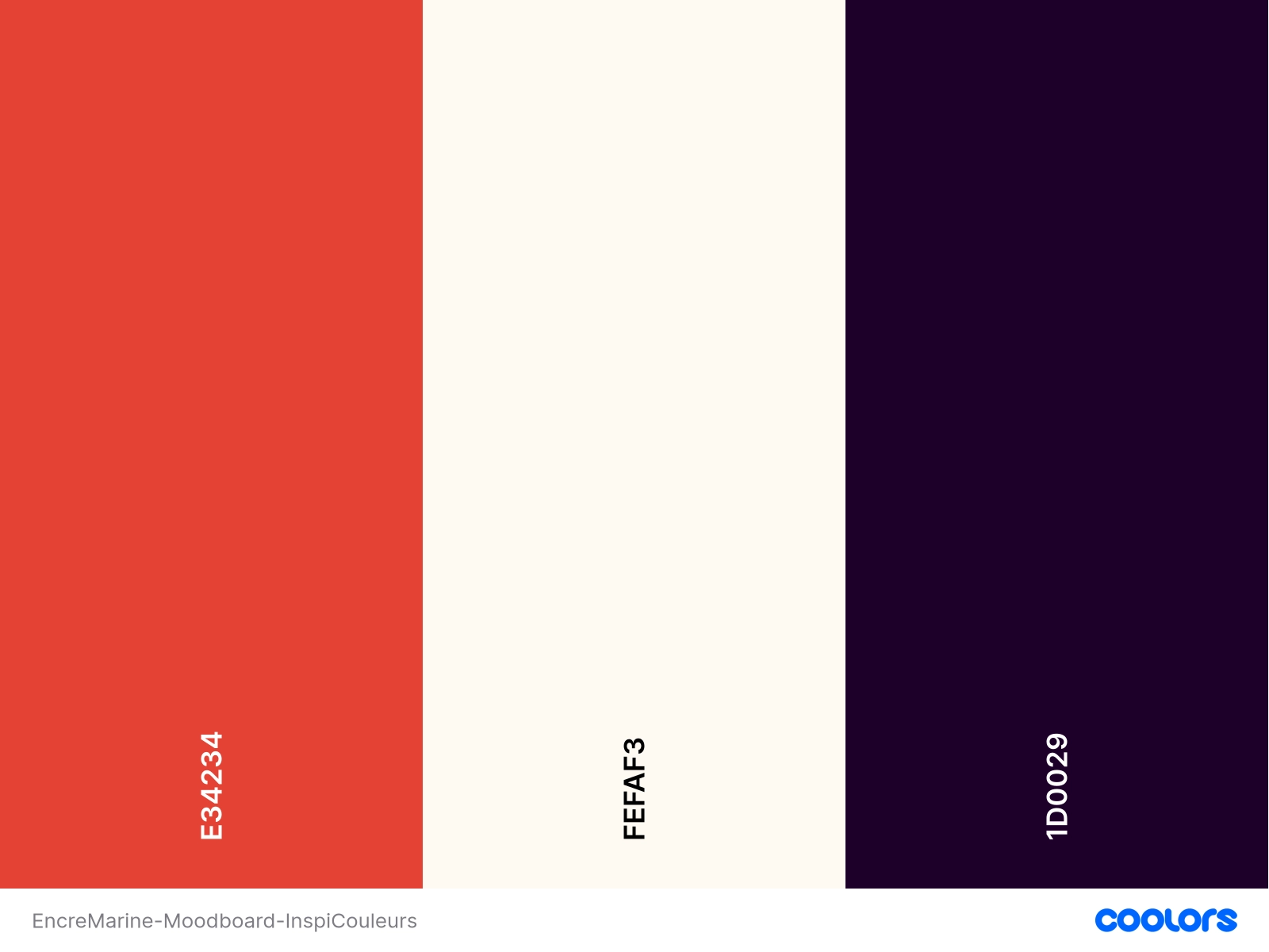
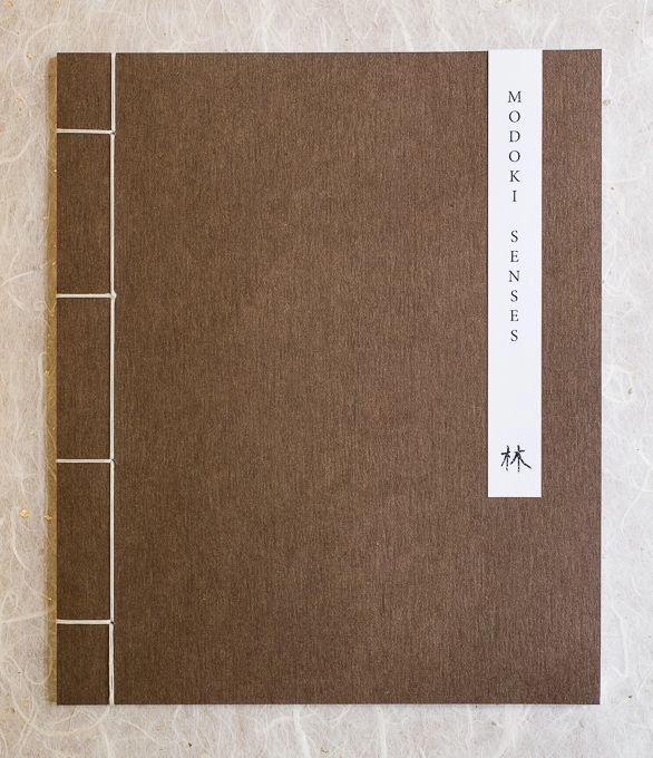
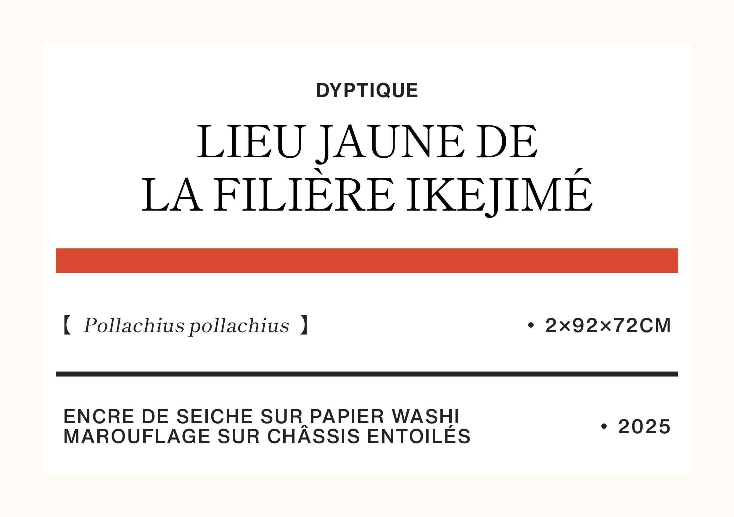
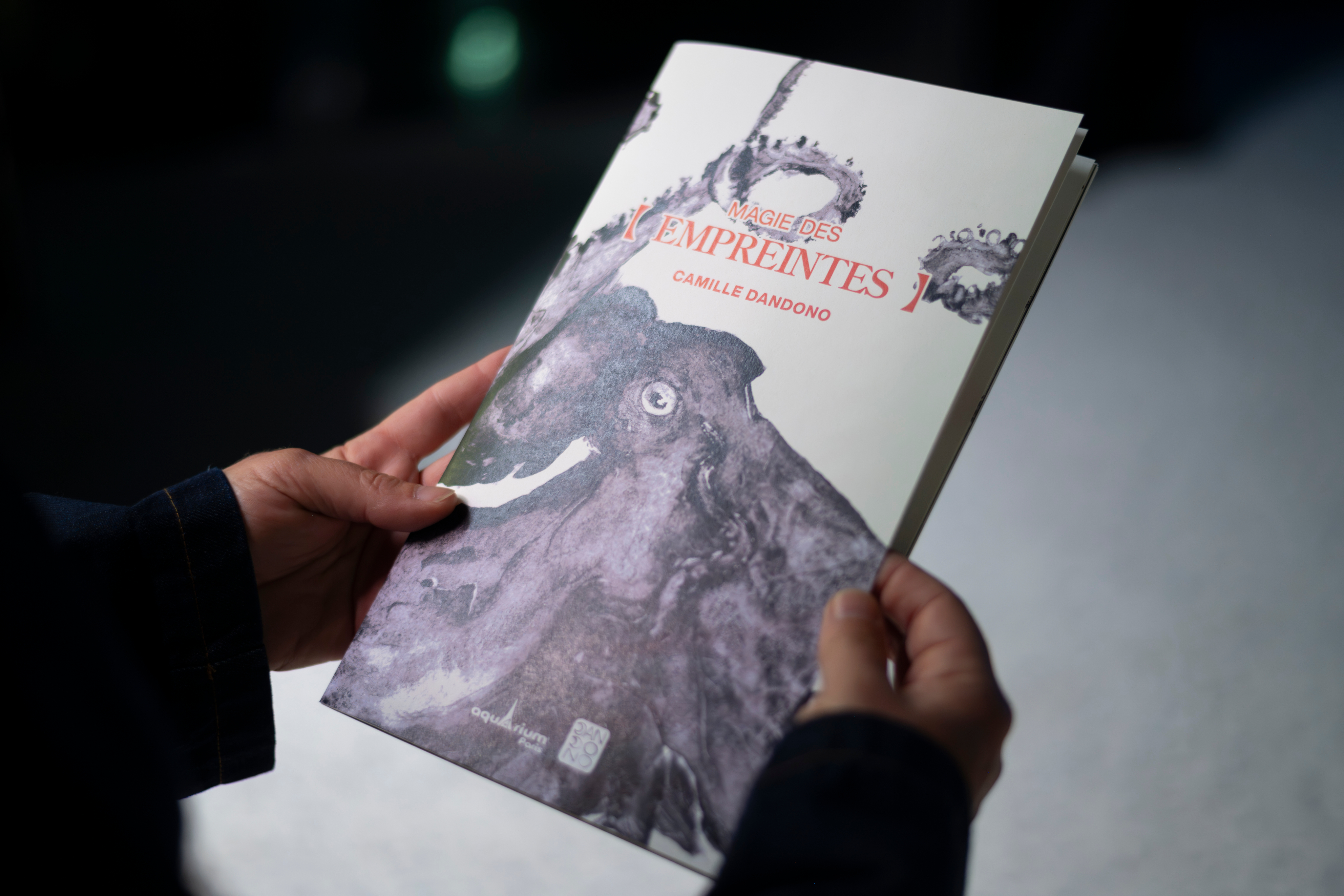
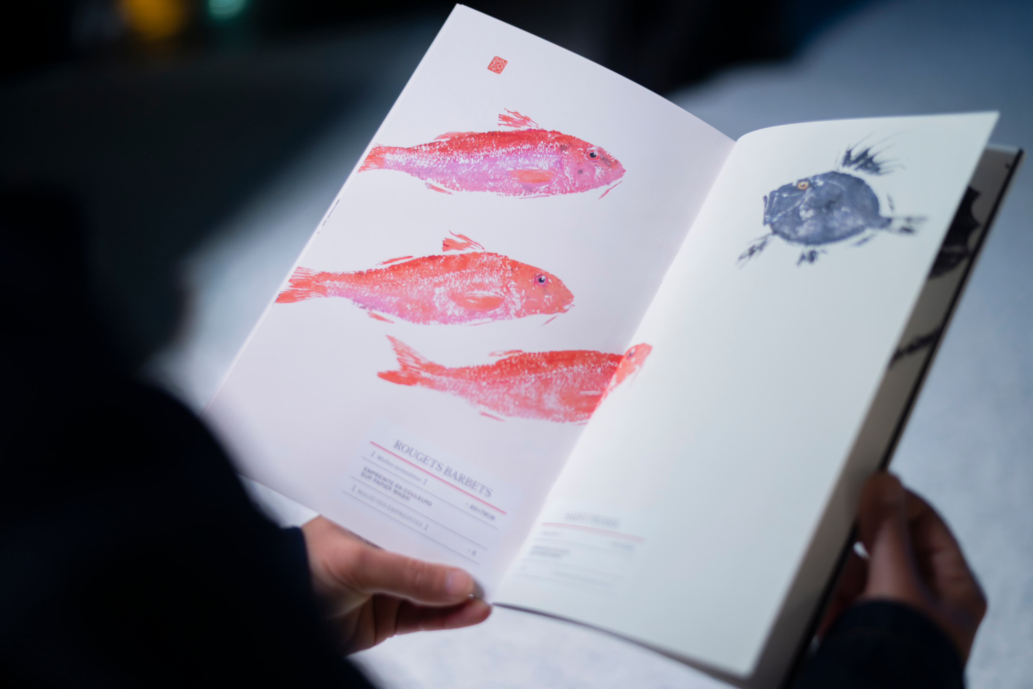
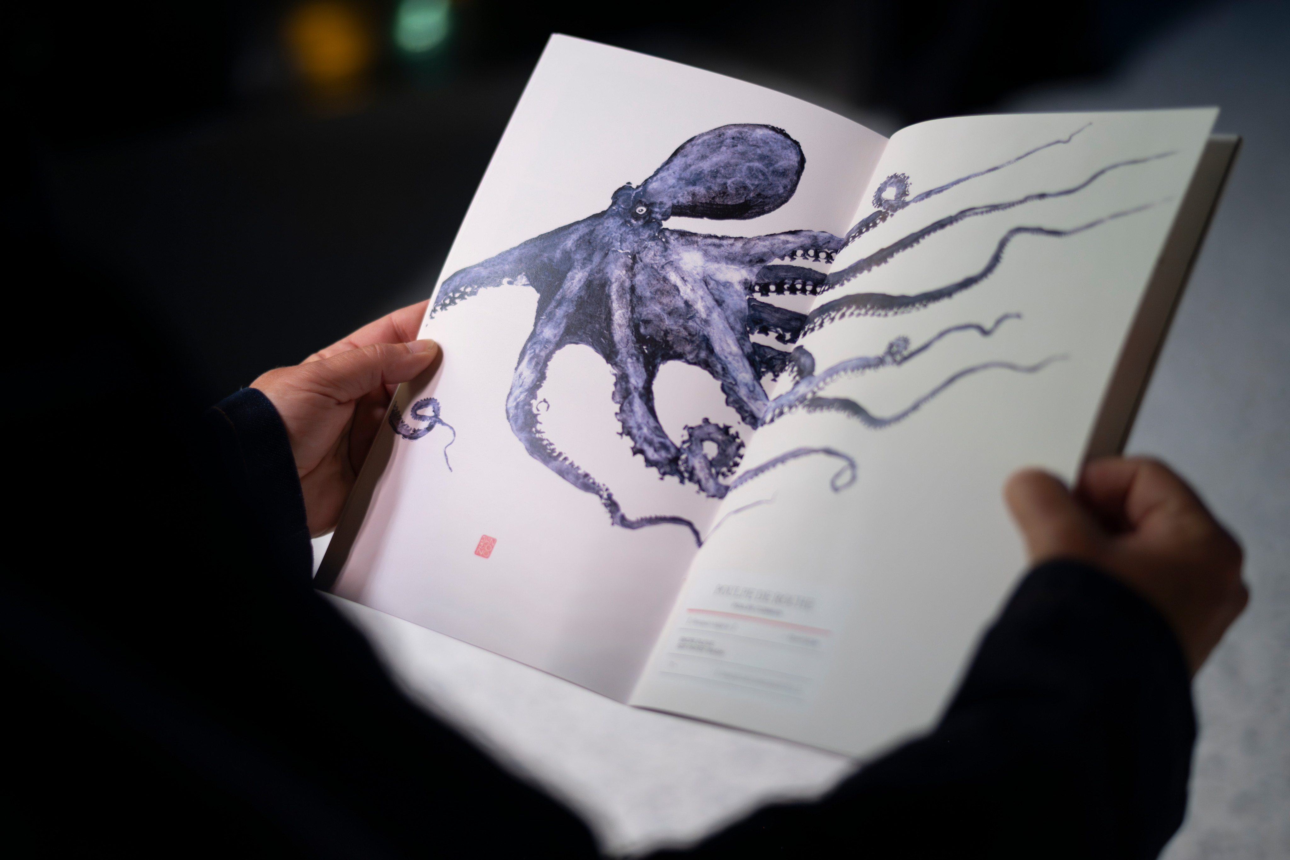
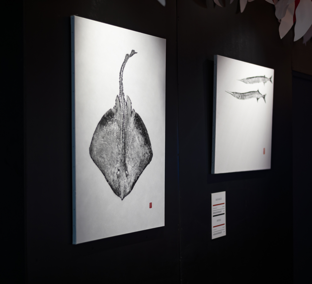
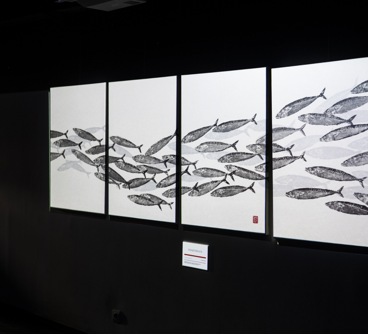
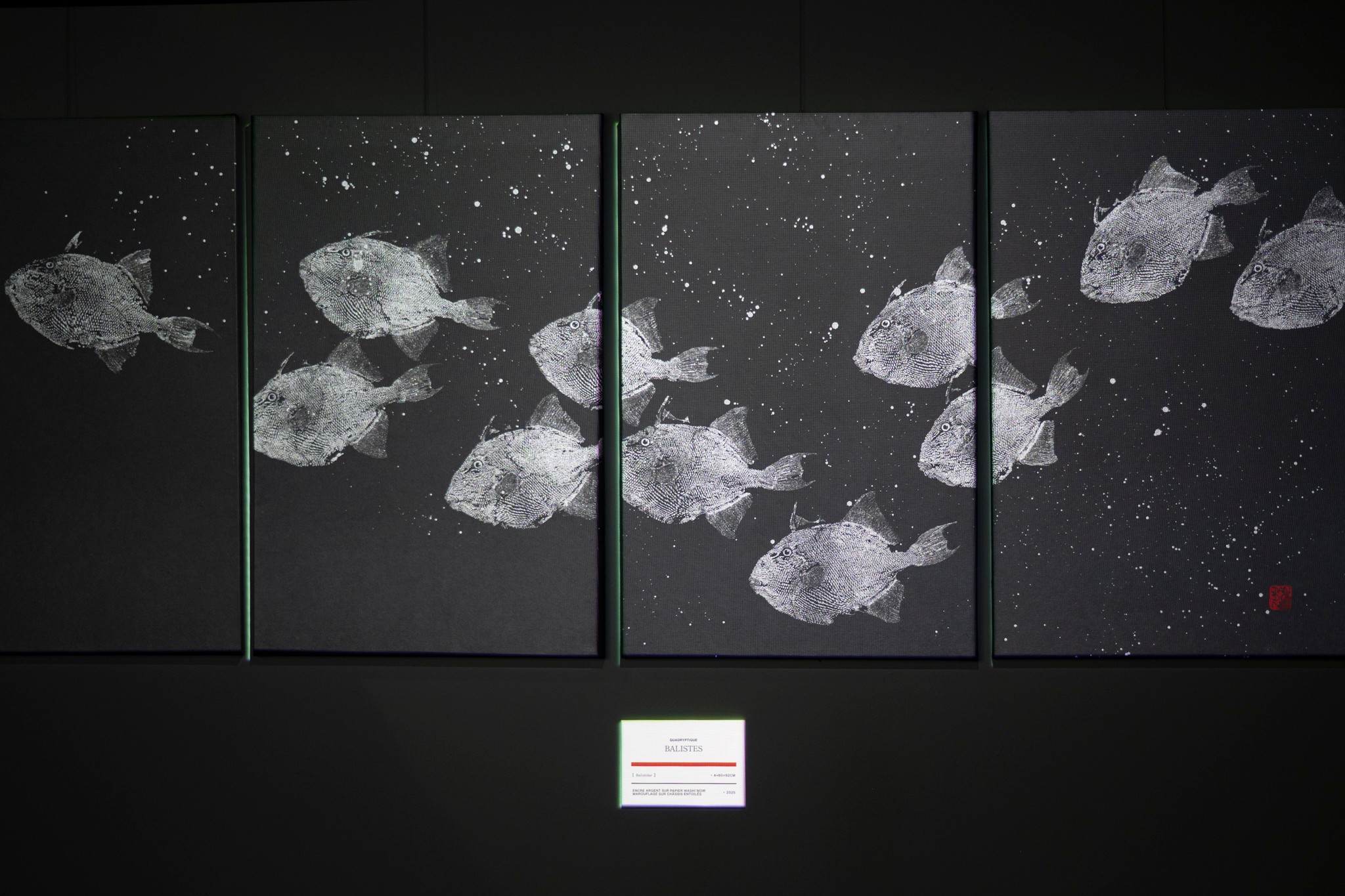
Japanese parentheses became the identity’s defining device. They frame the eyes of fish, species names, and key copy, carrying the dual meaning of focus and reverence. The color palette drew directly from the materials of the practice: beige from natural paper, charcoal from ink, brownish-red from the stamps of traditional Japanese paintings. Nothing was decorative. Typography bridges Eastern and Western influences: Shippori Mincho, a Japanese typeface paris with Helvetica Now, a Swiss one. Layouts were informed by two references: the utilitarian clarity of Muji, and the extensive white space of ukiyo-e woodblock prints, where emptiness creates tension rather than absence.
Application.
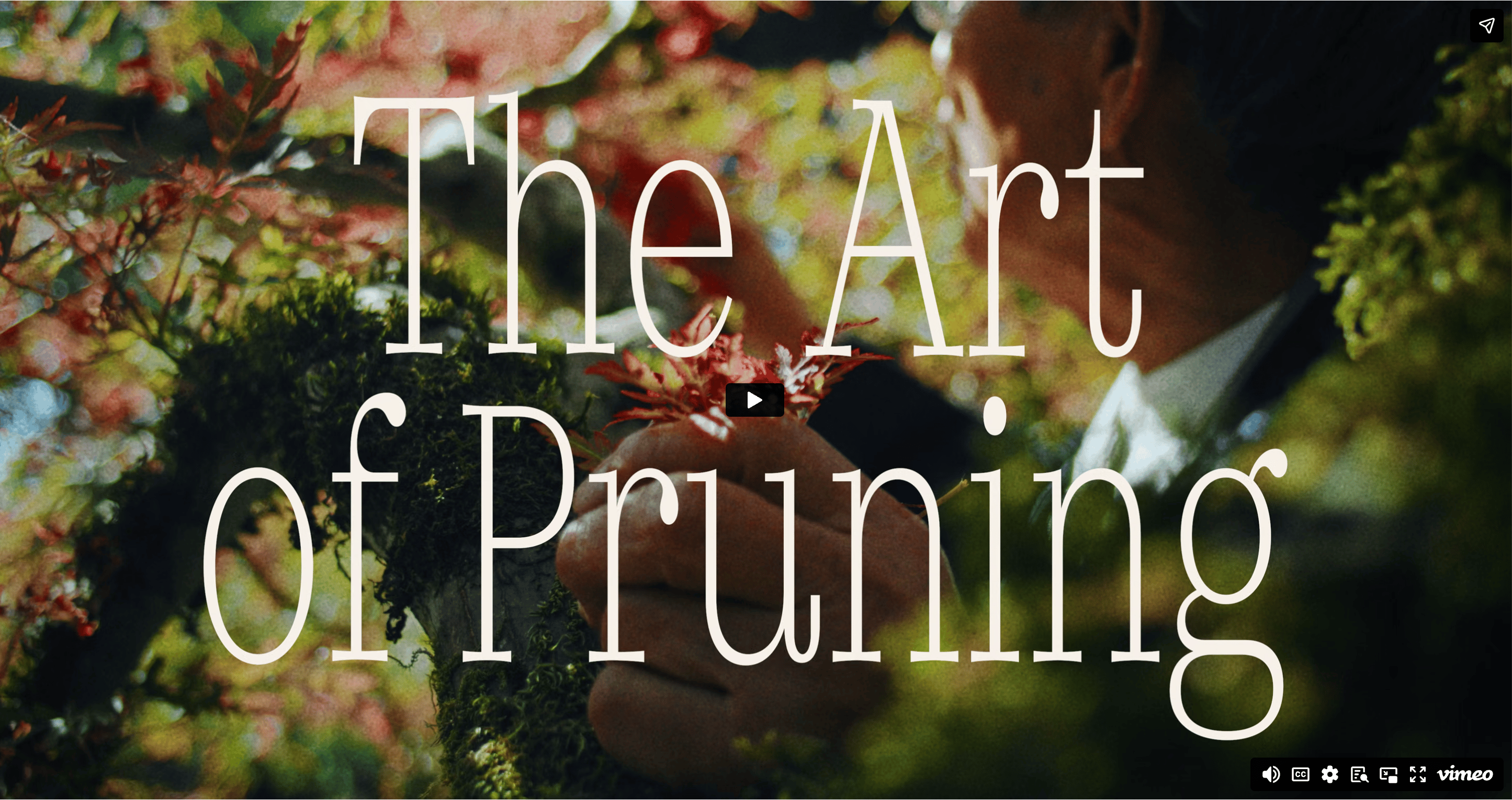
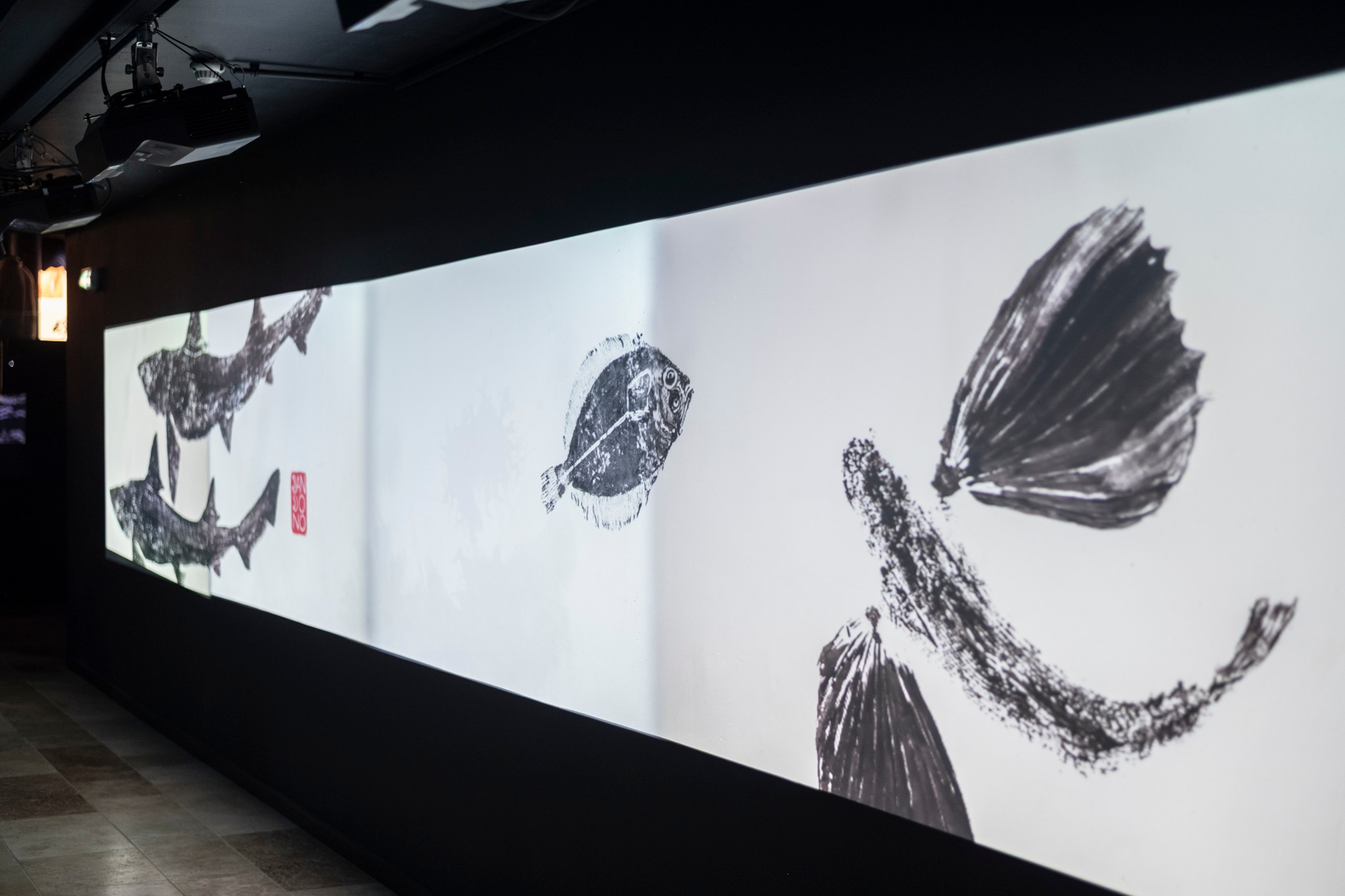
The identity was built to work across two across two registers simultaneously: the stillness of print and the movement of projection. Static assets used Ma, the principle to let compositions breathe. The projected works brought the same visual language into motion, extending the identity from wall to space. For the 4-minute mini-documentary screened onsite, I briefed the filmmaker on the creative direction, taking inspiration from the documentary “The Art of Pruning”. It is a restful video that honors the meditative nature of the practice. I provided keyframe layouts guidance for the projections and gave feedback on the edit until the pacing felt right. The film gave the exhibition a temporal dimension: visitors could watch the practice before standing in front of its results.

Key motion outputs. Motion outputs displays on screen and projected on the visitor path.
Mini-documentary. Projected in the onsite cinema. Audio on.
Outcome.
"The team that accompanied me brought all their expertise to complement my work, from the visuals created for social media and the projection videos (some of which were animated) to the production of the catalogue, which I find very successful."
— Camille Dandono, artist
Magie des Empreintes.
Industry. Culture.
Scope. Art direction, visual identity, editorial, campaign.
Year. 2026.
Credits. Camille Dandono (gyotaku art). Alizée Carpentier (motion & filmmaking). Isabelle Scotta (photography). Aquarium de Paris.

Magie des Empreintes.
Home.

Most people have never heard of gyotaku. That was both the challenge and the opportunity of Camille Dandono’s first Paris exhibition, Magie des Empreintes, held at the Aquarium de Paris. We built an experience that makes an unfamiliar practice feel immediately felt, even before it was understood. Physical prints and projected motion coexisted throughout the space, demanding a visual language that could hold its own across both stillness and movement.
Challenge.
Gyotaku is an ancient Japanese technique of printing directly from fish, largely unknown to Parisian audiences. The challenge was to introduce both the artist and the practice in a way that honored the depth of the tradition without making it feel inaccessible. This was also a personal milestone: their first exhibition in Paris, bringing a Briton artist into the capital for the first time.
Strategy.
In conversation with the artist, I unveil the meaning of the beneath technique. It is a ritual of memory and connection. Gyotaku connects fishermen to the fish they catch. For the artist, it connects them to their close ones. I built the identity around the idea that every print is an act of remembrance, a way of holding something that can’t be held. To bridge Eastern and Western audiences, I took references from art techniques and design styles that span across both worlds.
Identity.
Japanese parentheses became the identity’s defining device. They frame the eyes of fish, species names, and key copy, carrying the dual meaning of focus and reverence. The color palette drew directly from the materials of the practice: beige from natural paper, charcoal from ink, brownish-red from the stamps of traditional Japanese paintings. Nothing was decorative. Typography bridges Eastern and Western influences: Shippori Mincho, a Japanese typeface paris with Helvetica Now, a Swiss one. Layouts were informed by two references: the utilitarian clarity of Muji, and the extensive white space of ukiyo-e woodblock prints, where emptiness creates tension rather than absence.
Application.
The identity was built to work across two across two registers simultaneously: the stillness of print and the movement of projection. Static assets used Ma, the principle to let compositions breathe. The projected works brought the same visual language into motion, extending the identity from wall to space. For the 4-minute mini-documentary screened onsite, I briefed the filmmaker on the creative direction, taking inspiration from the documentary “The Art of Pruning”. It is a restful video that honors the meditative nature of the practice. I provided keyframe layouts guidance for the projections and gave feedback on the edit until the pacing felt right. The film gave the exhibition a temporal dimension: visitors could watch the practice before standing in front of its results.

Key motion outputs. Motion outputs displays on screen and projected on the visitor path.
Mini-documentary. Projected in the onsite cinema.
Outcome.
"The team that accompanied me brought all their expertise to complement my work, from the visuals created for social media and the projection videos (some of which were animated) to the production of the catalogue, which I find very successful."
— Camille Dandono, artist
Magie des Empreintes.
Industry. Culture.
Scope. Art direction, visual identity, editorial, campaign.
Year. 2026.
Credits. Camille Dandono (gyotaku art). Alizée Carpentier (motion & filmmaking). Isabelle Scotta (photography). Aquarium de Paris.
