SNF.
Home.

A public institution with a deeply human mission. The Social Endowment Fund of the Capital City of Prague (Sociální nadační fond hlavního města Prahy) supports residents at risk of social distress. This branch of city government needed to feel approachable to the very people it serves.
Challenge.
Build a brand identity for a Prague public institution that resonates across generations without falling into civic design clichés. The project was a test brief for Prague-based agency Cocoon.

Strategy.
Czech communication culture tends toward directness and action over sentiment. Rather than leading with emotion, the identity leans into straightforward, action-driven messaging. It’s clear, unpretentious, and immediately legible to locals.

Identity.
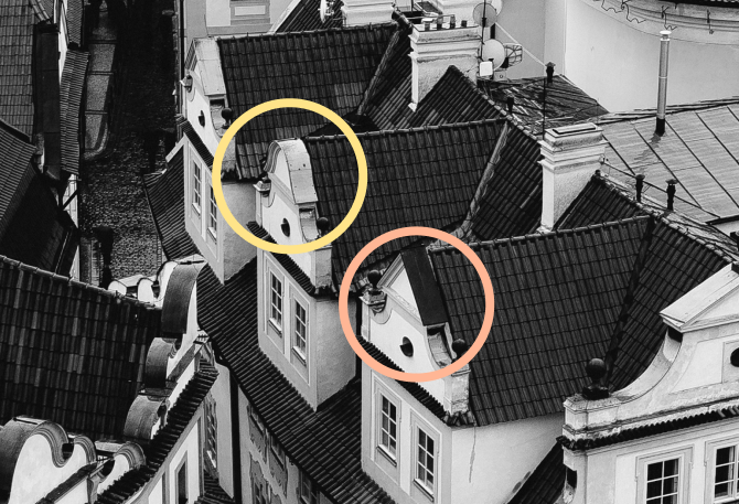
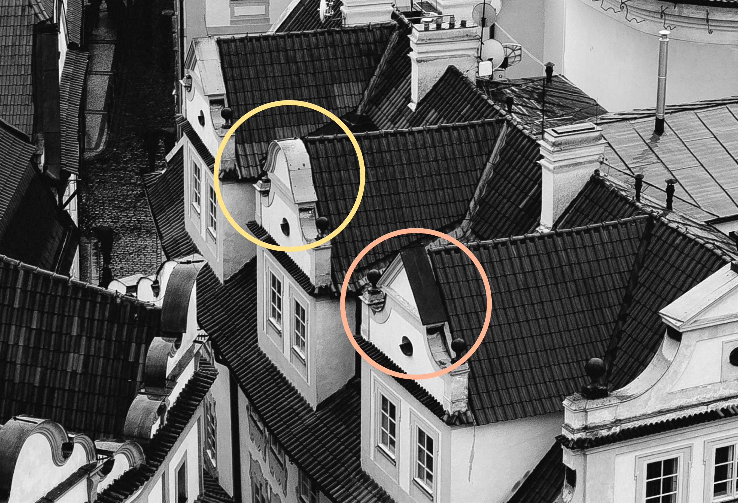
The visual language draws from Prague's own streets. Window ornaments found throughout the traditional districts of the Old and New Towns became the core visual device. It’s a reference instantly recognizable to residents, grounding the brand in the city it serves without resorting to tired landmarks or generic civic symbolism.



Application.
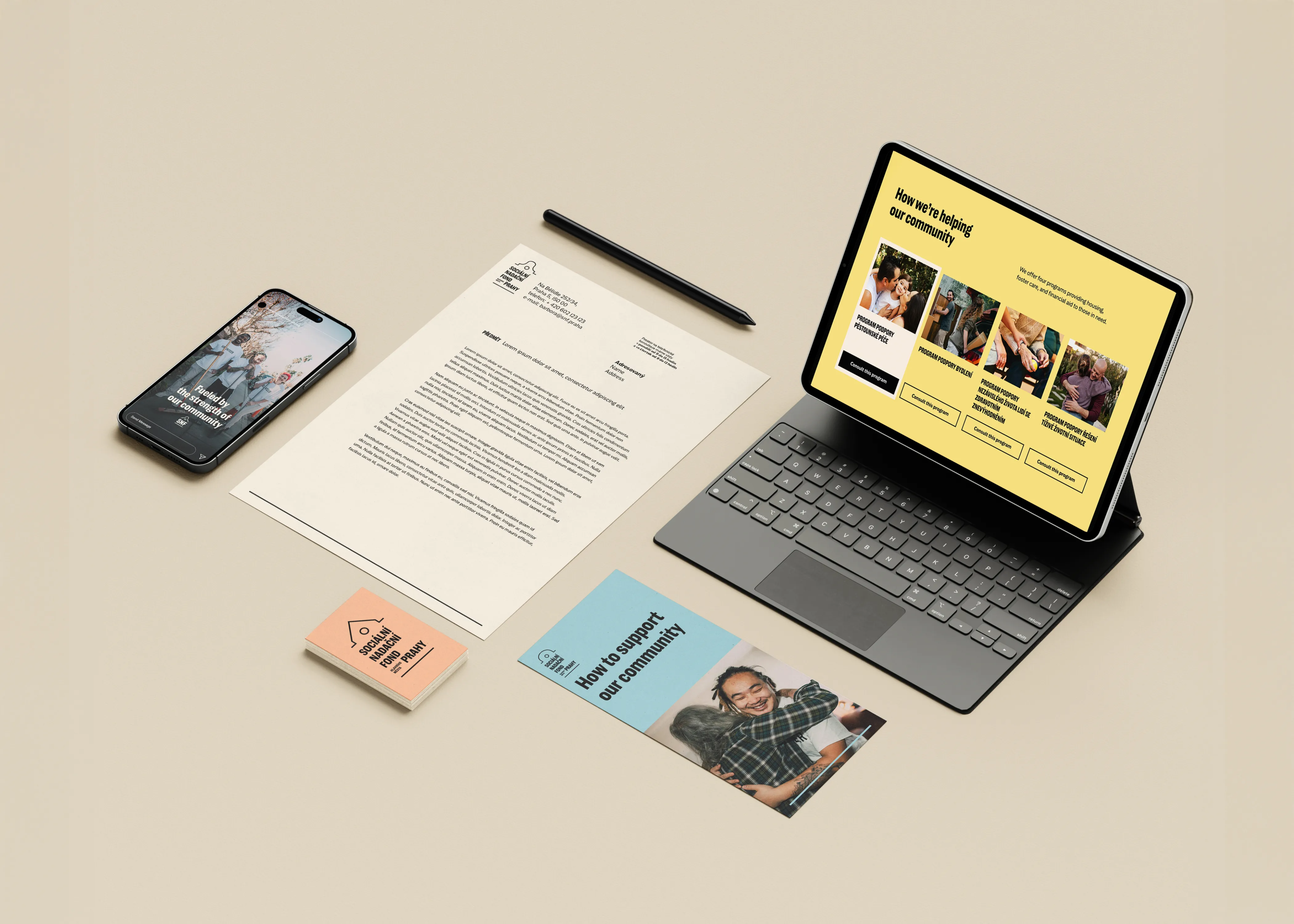
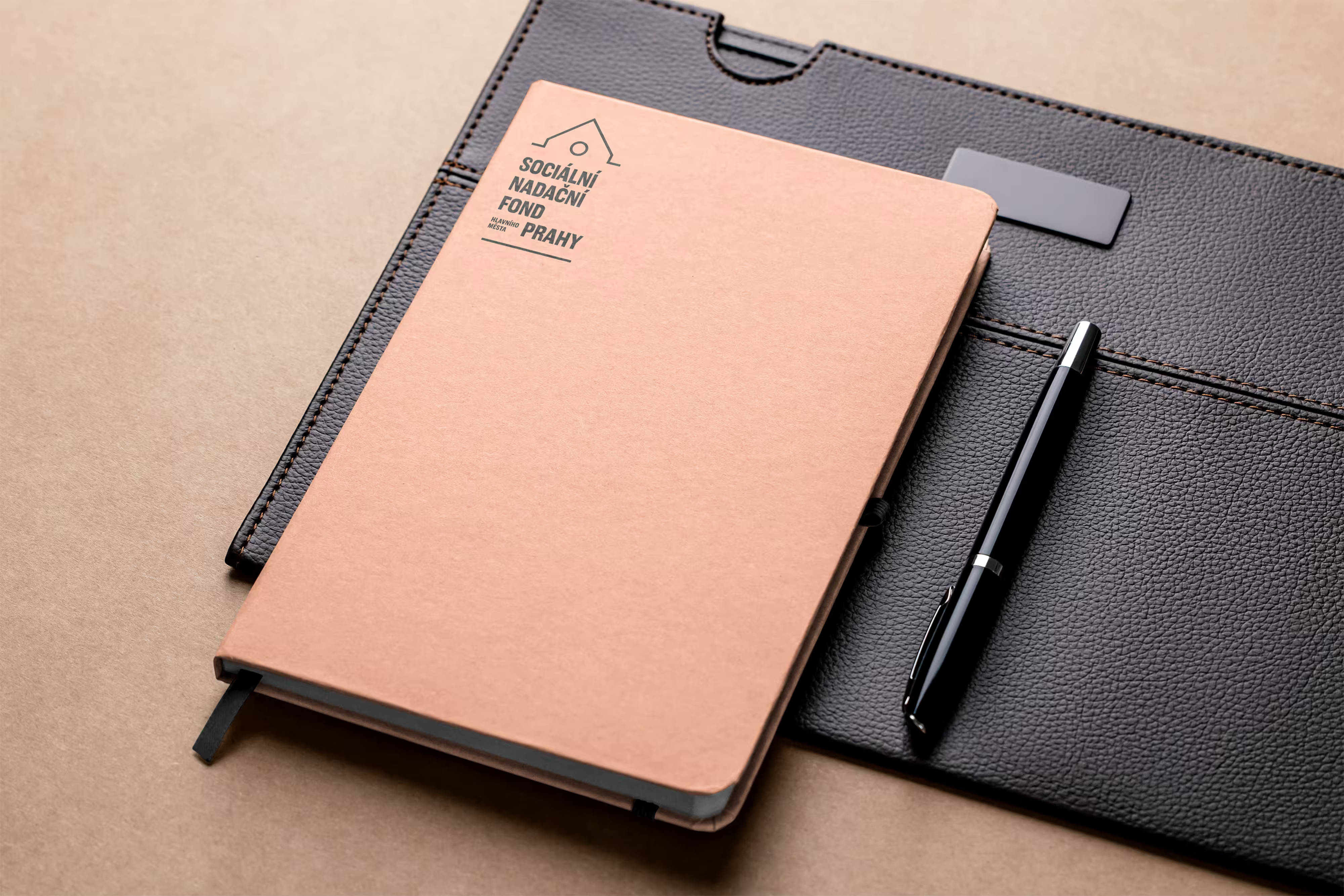
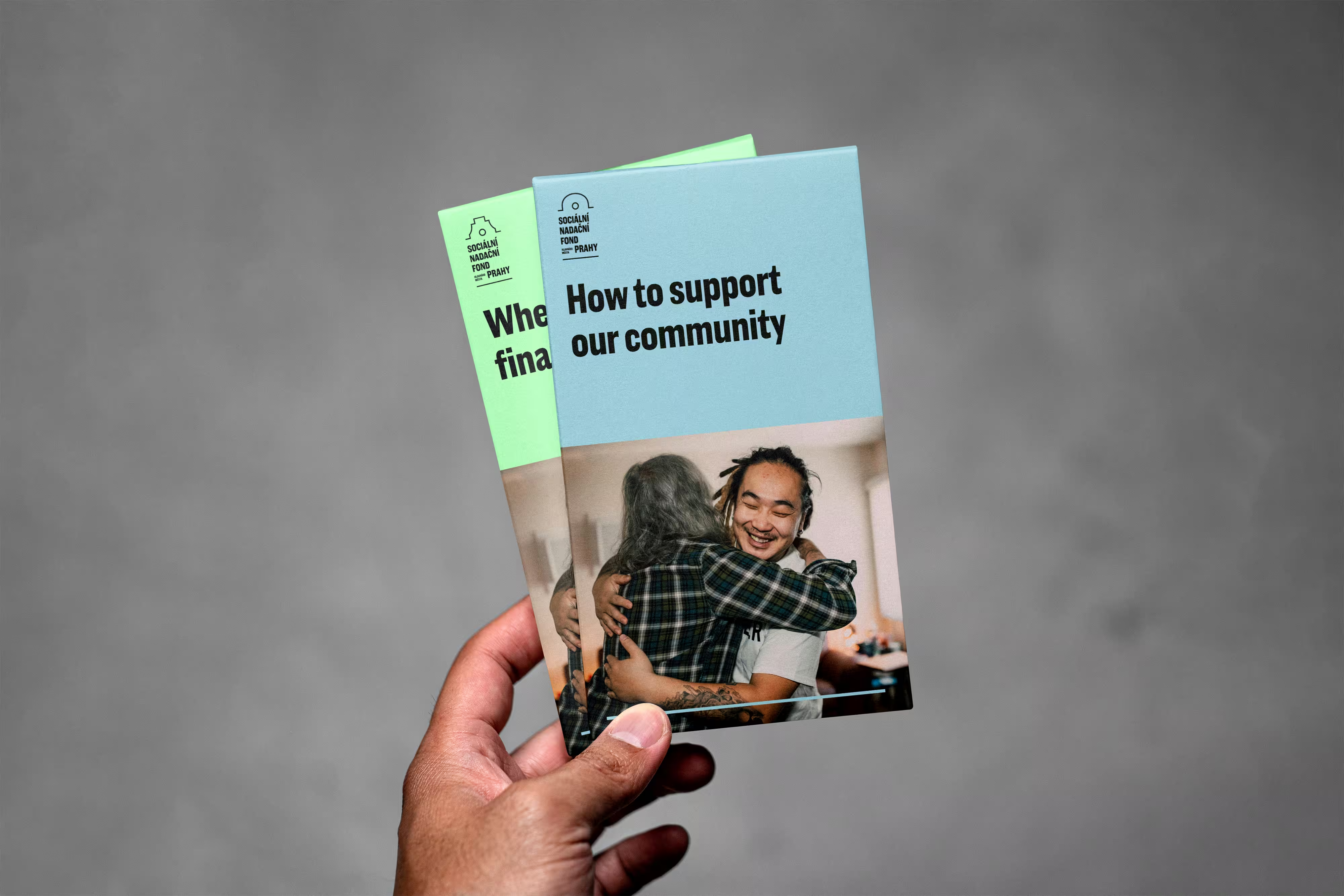
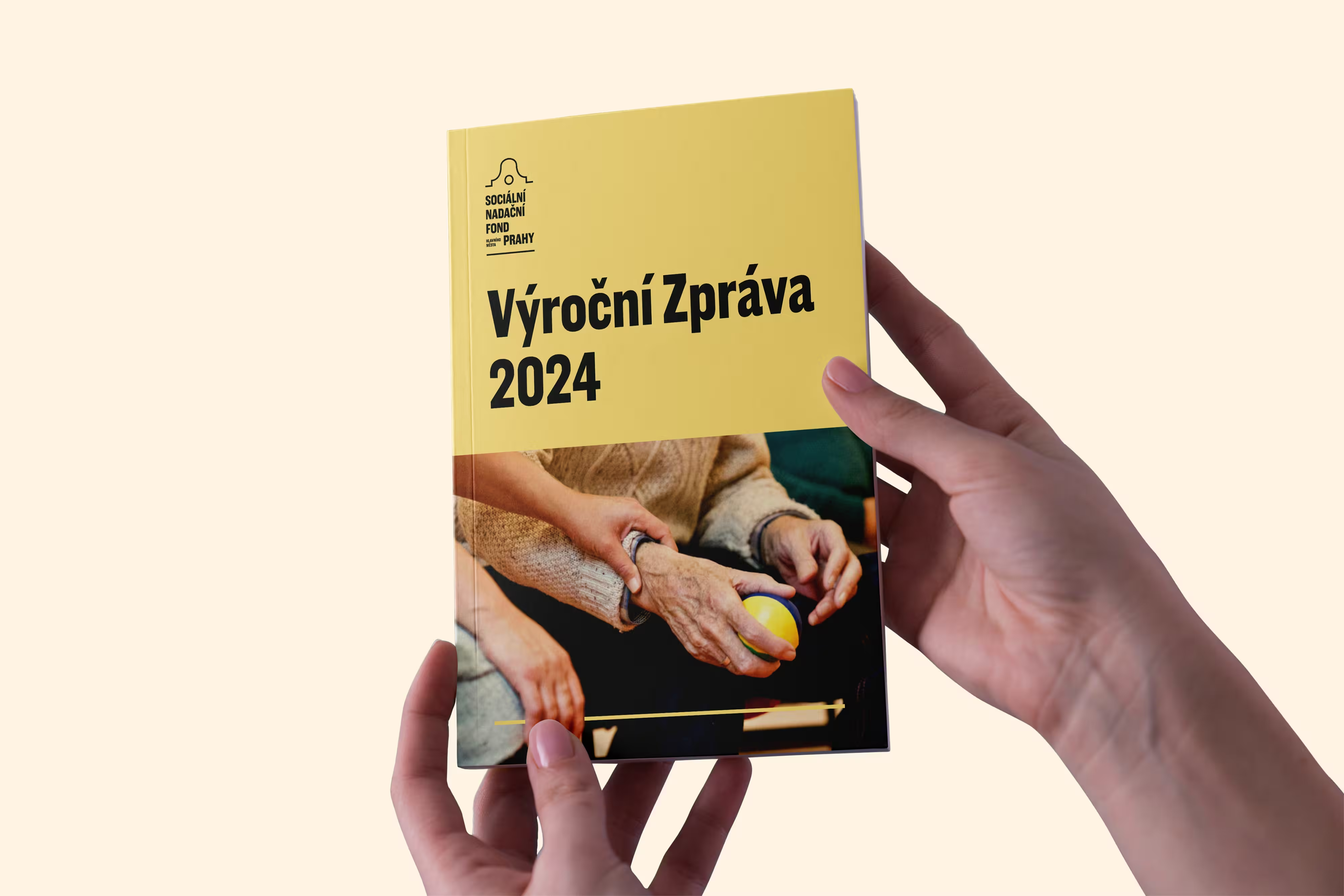
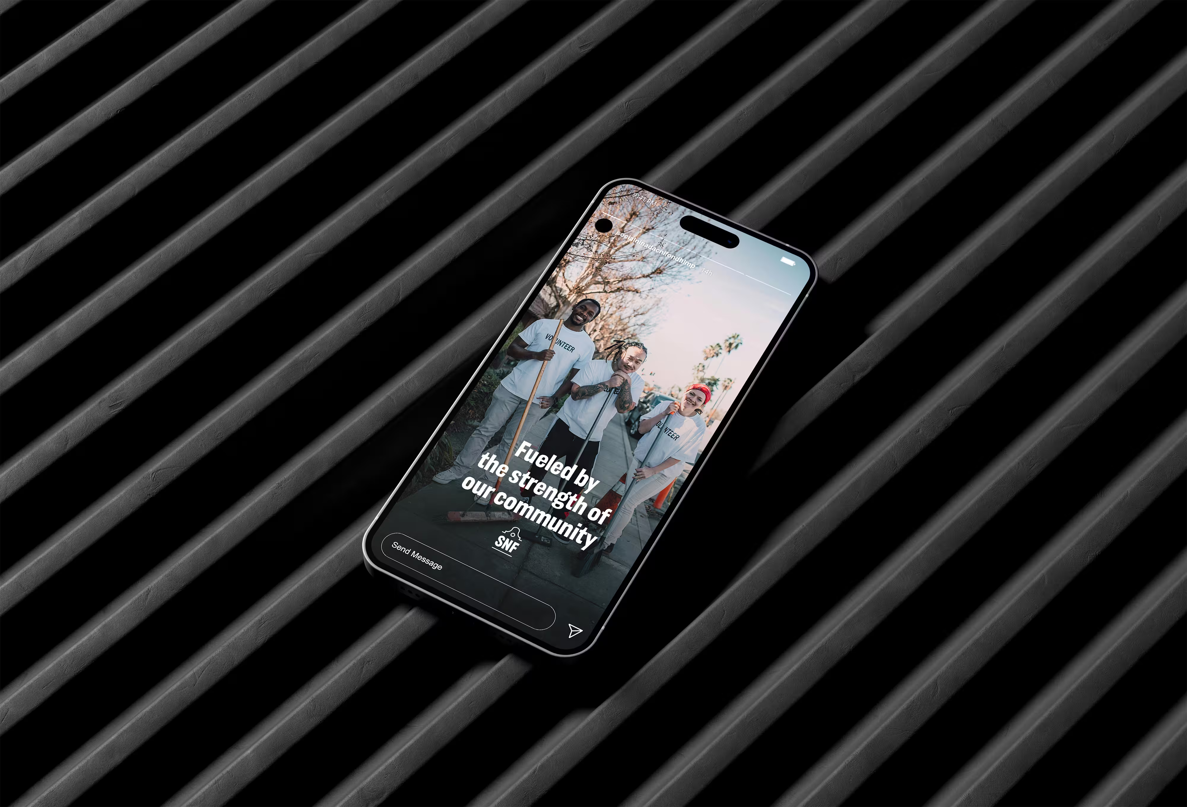
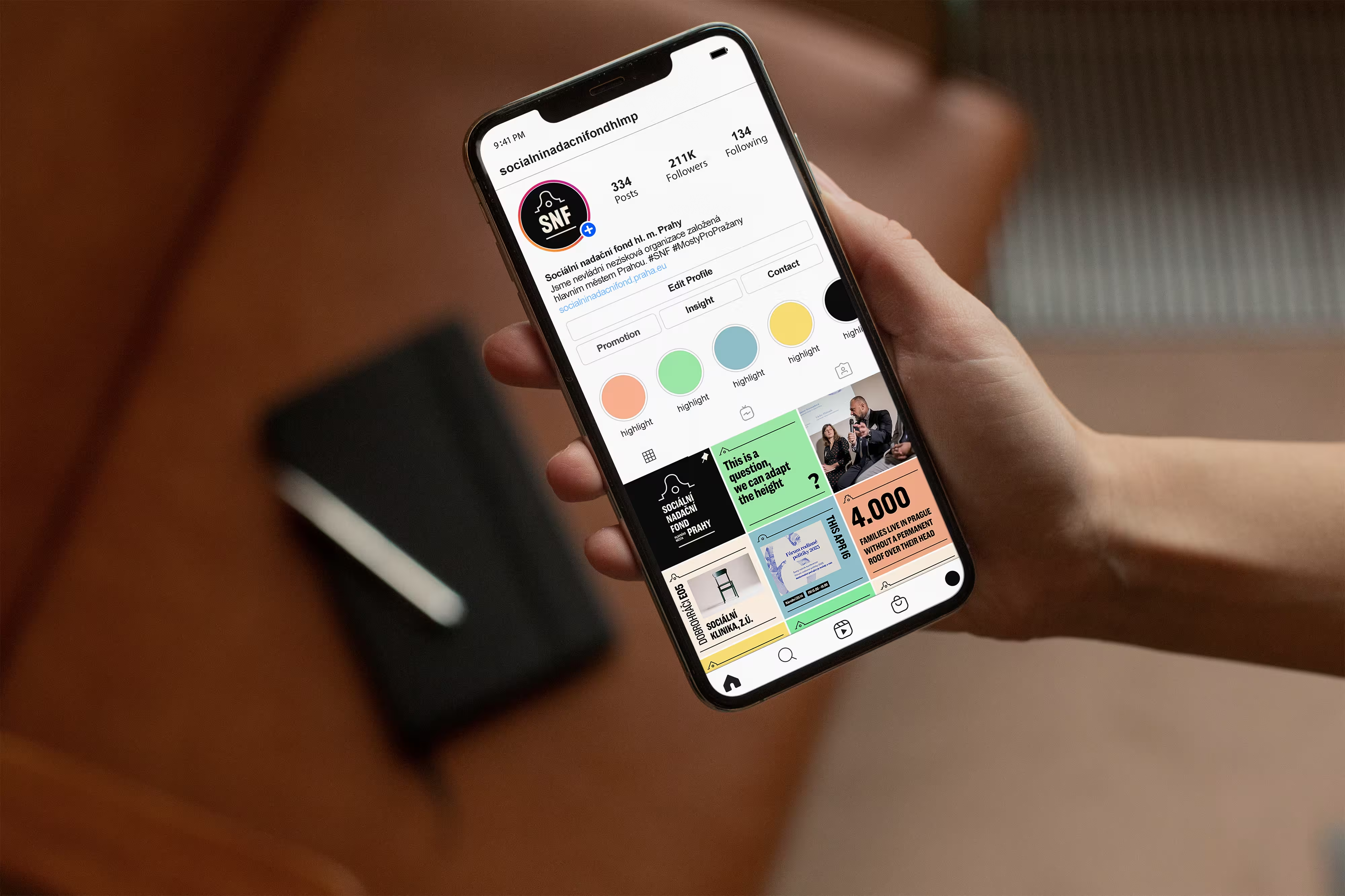
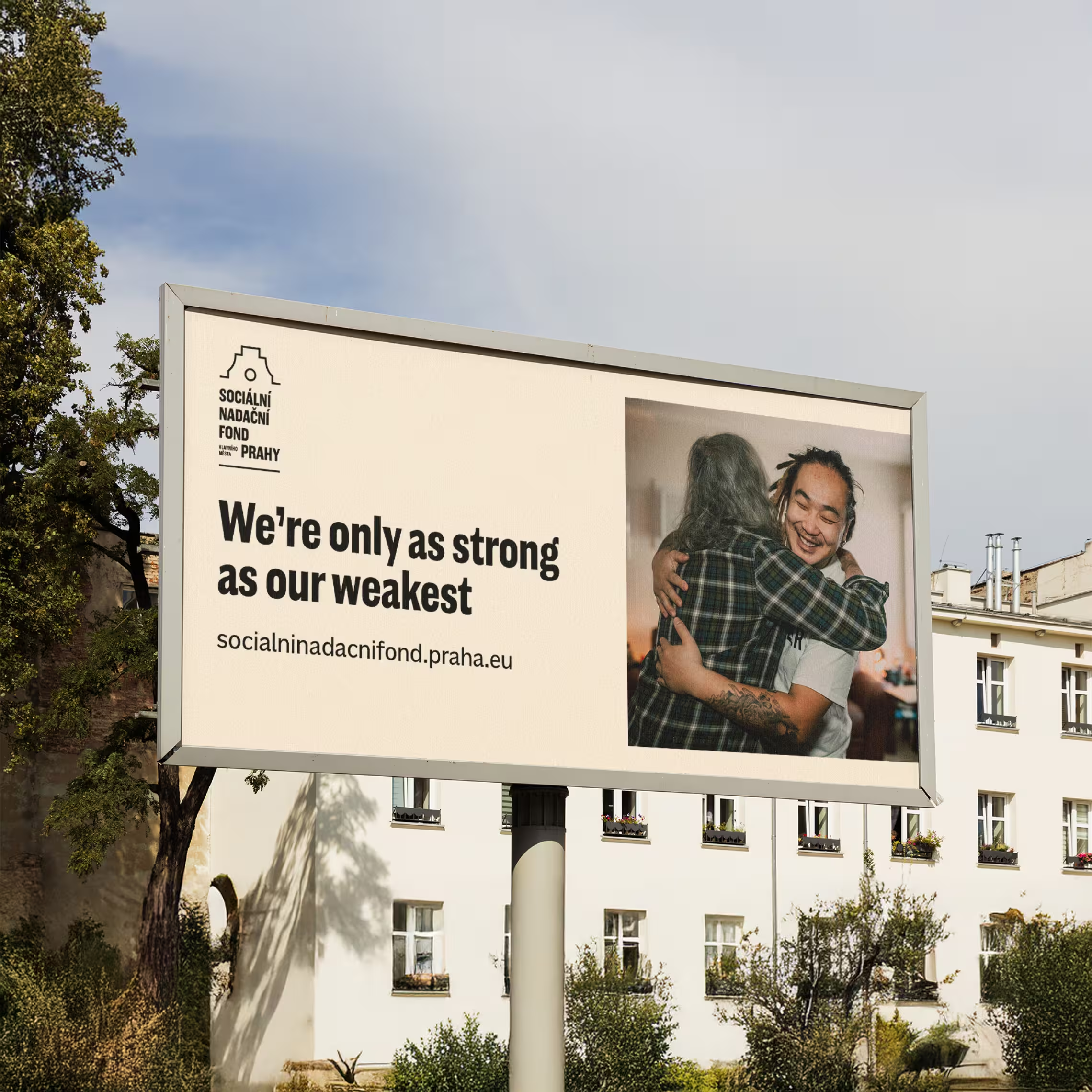
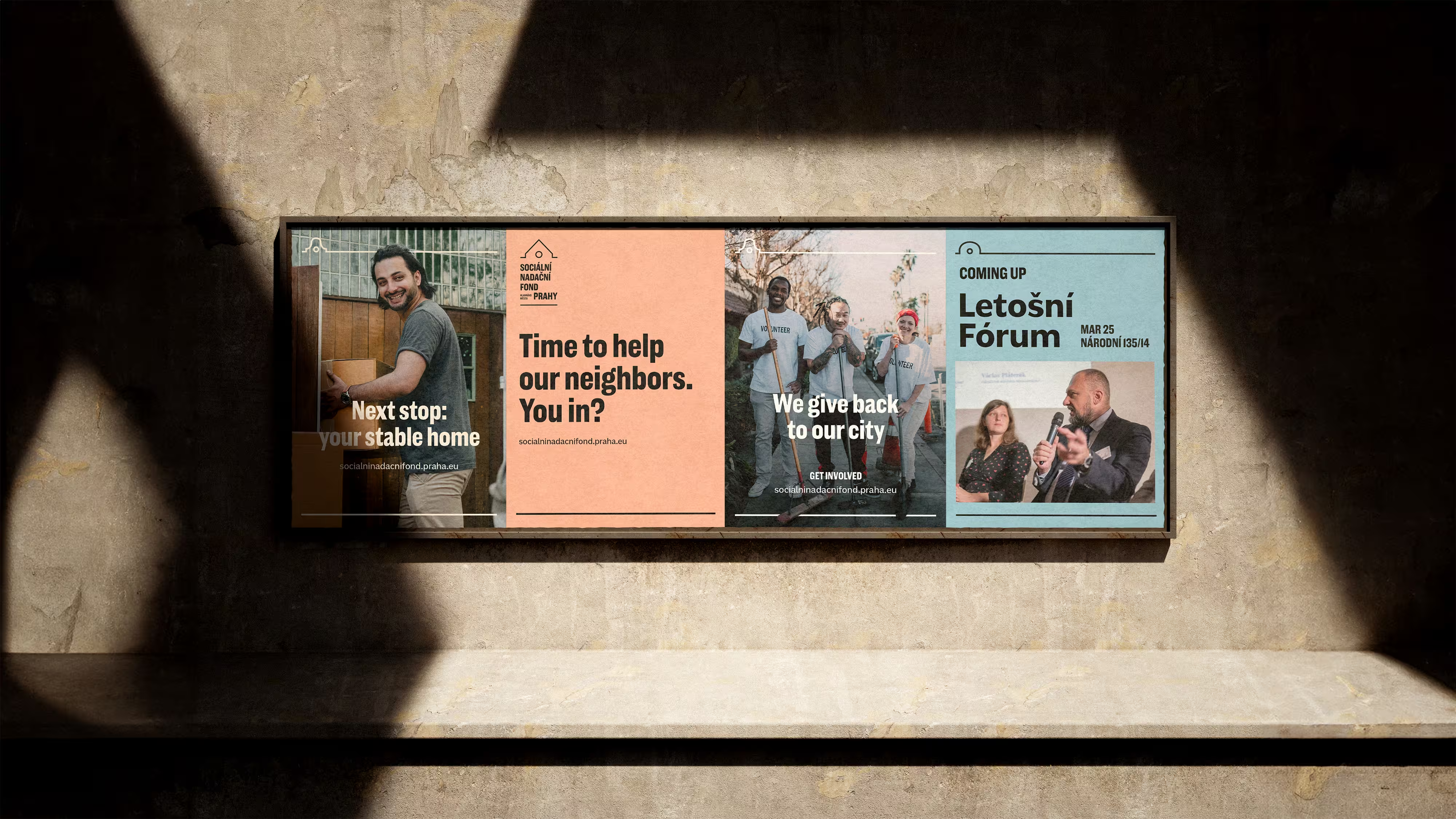
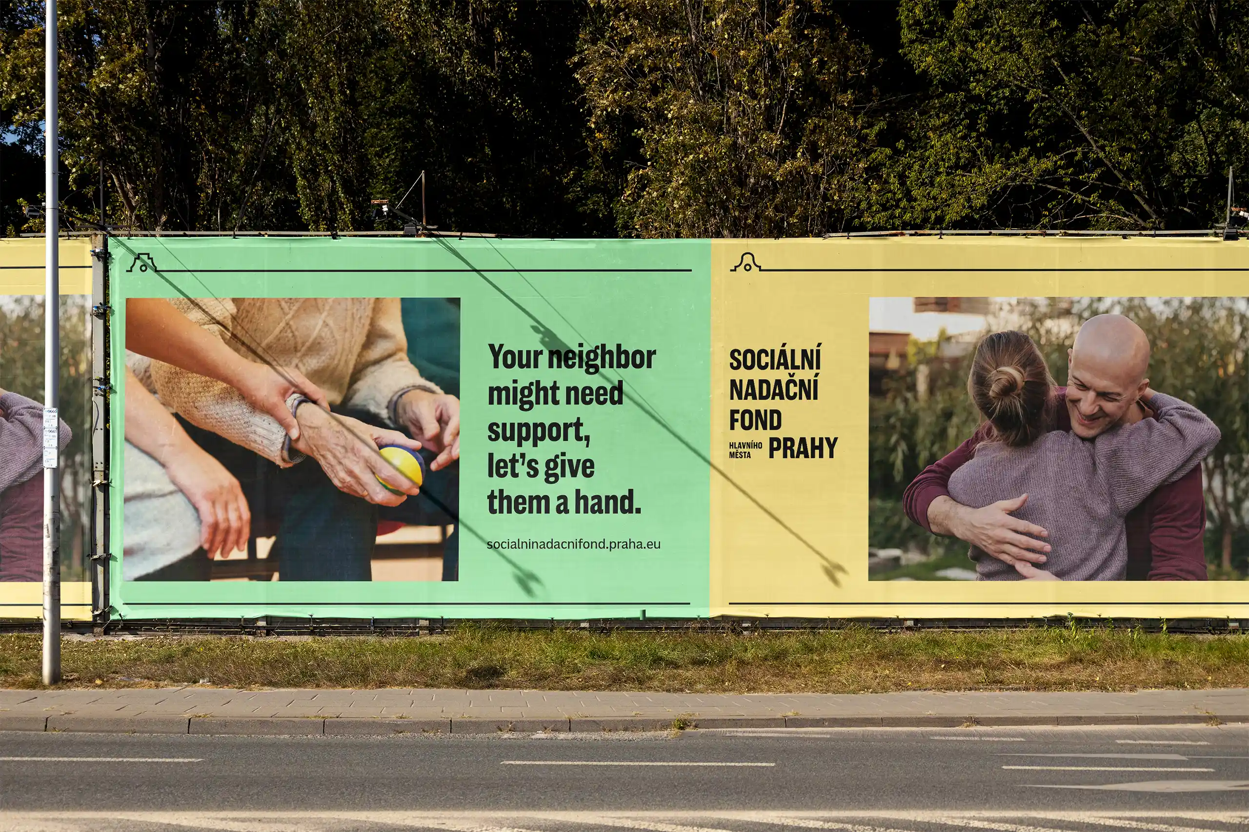
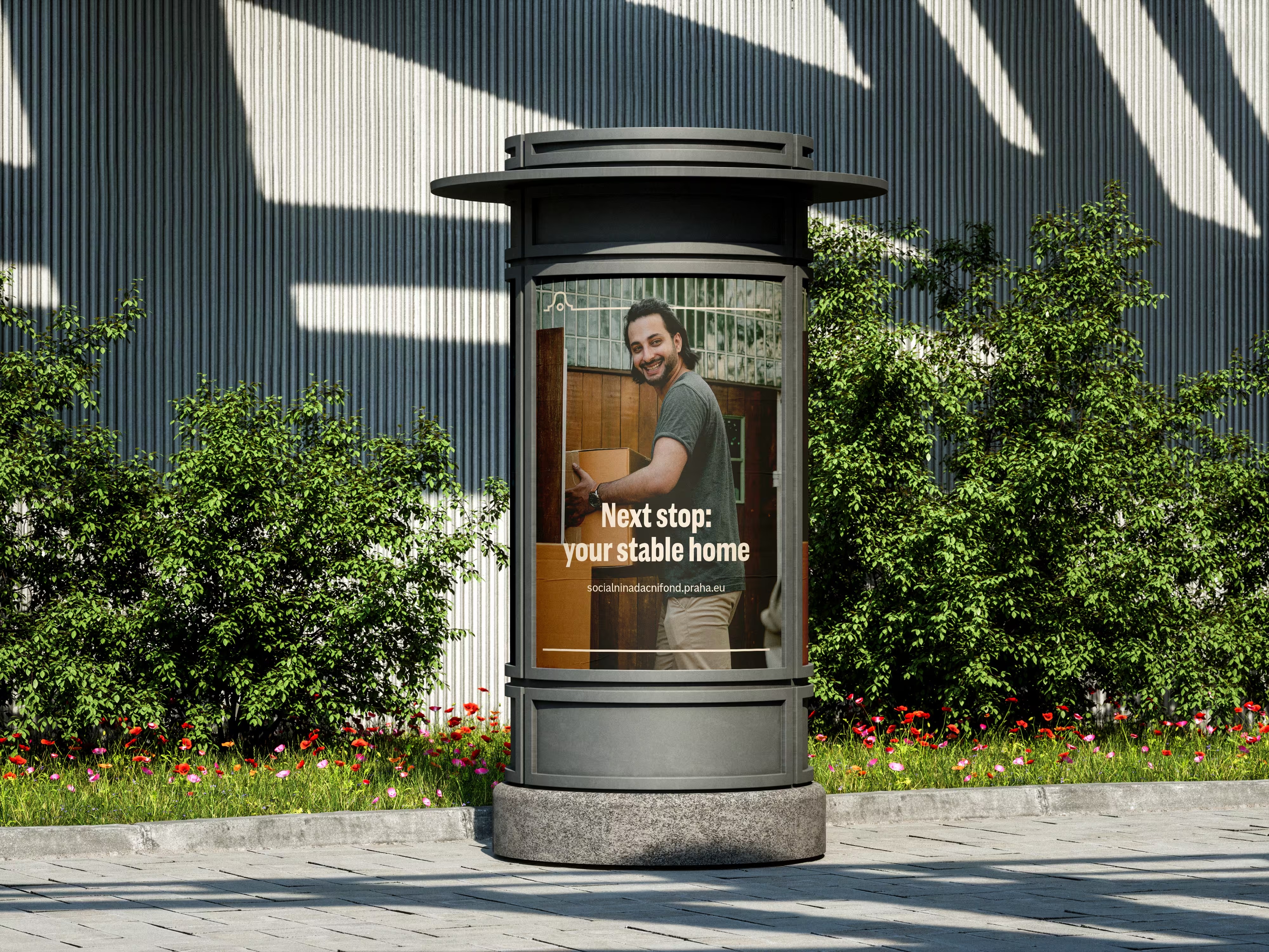
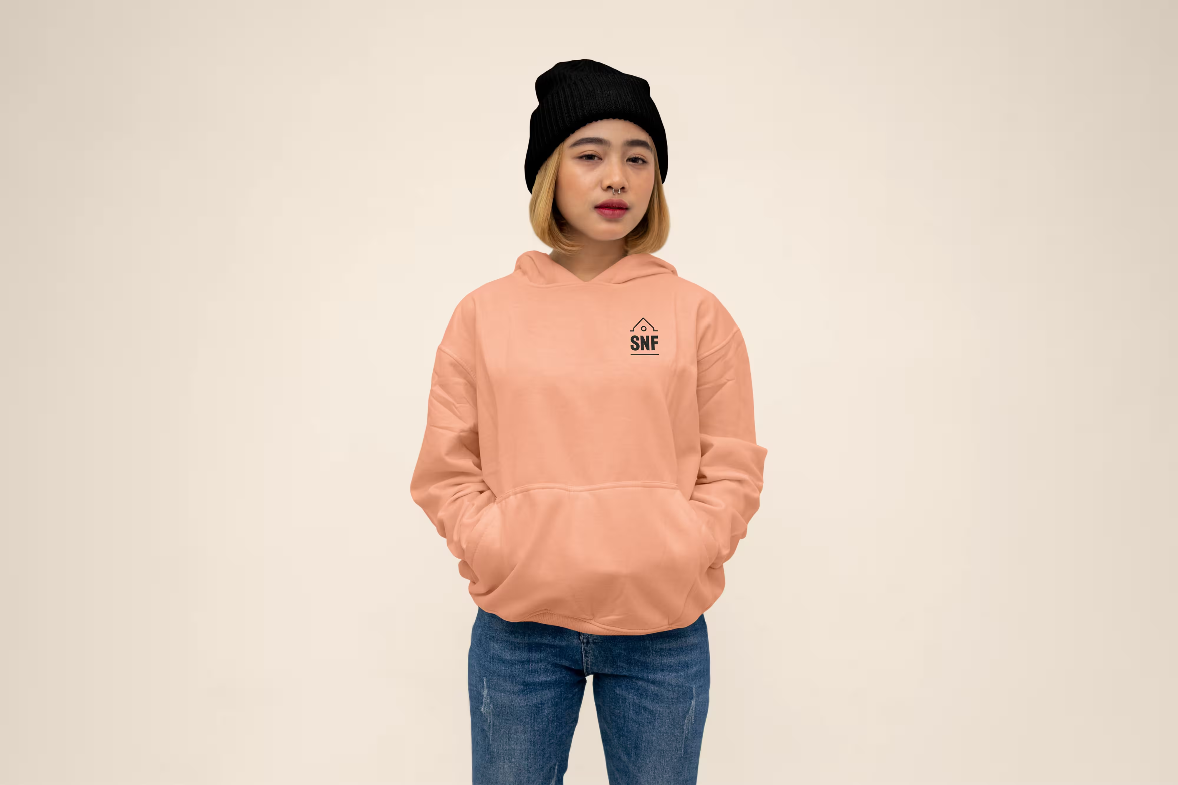
Copy-driven layouts with simple, colorful compositions. The identity prioritizes clarity and accessibility, letting direct messaging carry the communication across touchpoints.
Outcome.
The concept was strong enough to land the job. Cocoon hired me off the back of this test brief.
Industry. Civic service.
Scope. Visual identity.
Year. 2024.

SNF.
Home.

A public institution with a deeply human mission. The Social Endowment Fund of the Capital City of Prague (Sociální nadační fond hlavního města Prahy) supports residents at risk of social distress. This branch of city government needed to feel approachable to the very people it serves.
Challenge.
Build a brand identity for a Prague public institution that resonates across generations without falling into civic design clichés. The project was a test brief for Prague-based agency Cocoon.
Strategy.
Czech communication culture tends toward directness and action over sentiment. Rather than leading with emotion, the identity leans into straightforward, action-driven messaging. It’s clear, unpretentious, and immediately legible to locals.
Identity.
The visual language draws from Prague's own streets. Window ornaments found throughout the traditional districts of the Old and New Towns became the core visual device. It’s a reference instantly recognizable to residents, grounding the brand in the city it serves without resorting to tired landmarks or generic civic symbolism.


Application.
Copy-driven layouts with simple, colorful compositions. The identity prioritizes clarity and accessibility, letting direct messaging carry the communication across touchpoints.
Outcome.
The concept was strong enough to land the job. Cocoon hired me off the back of this test brief.
Industry. Civic service.
Scope. Visual identity.
Year. 2024.
