Zephyr
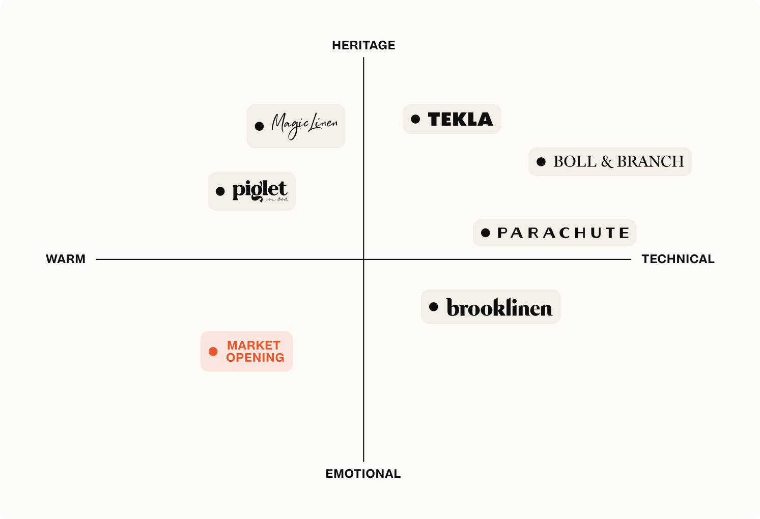
The premium DTC bedding market is built on sameness. Thread counts, certifications, natural materials, and a muted visual language that signals quality without warmth. Brands in this space speak to the head of a considered buyer. Zephyr was conceived to speak to the heart instead. A fictional brand built around a single idea: coziness as an emotional constant, not a seasonal purchase.
Brand Keywords


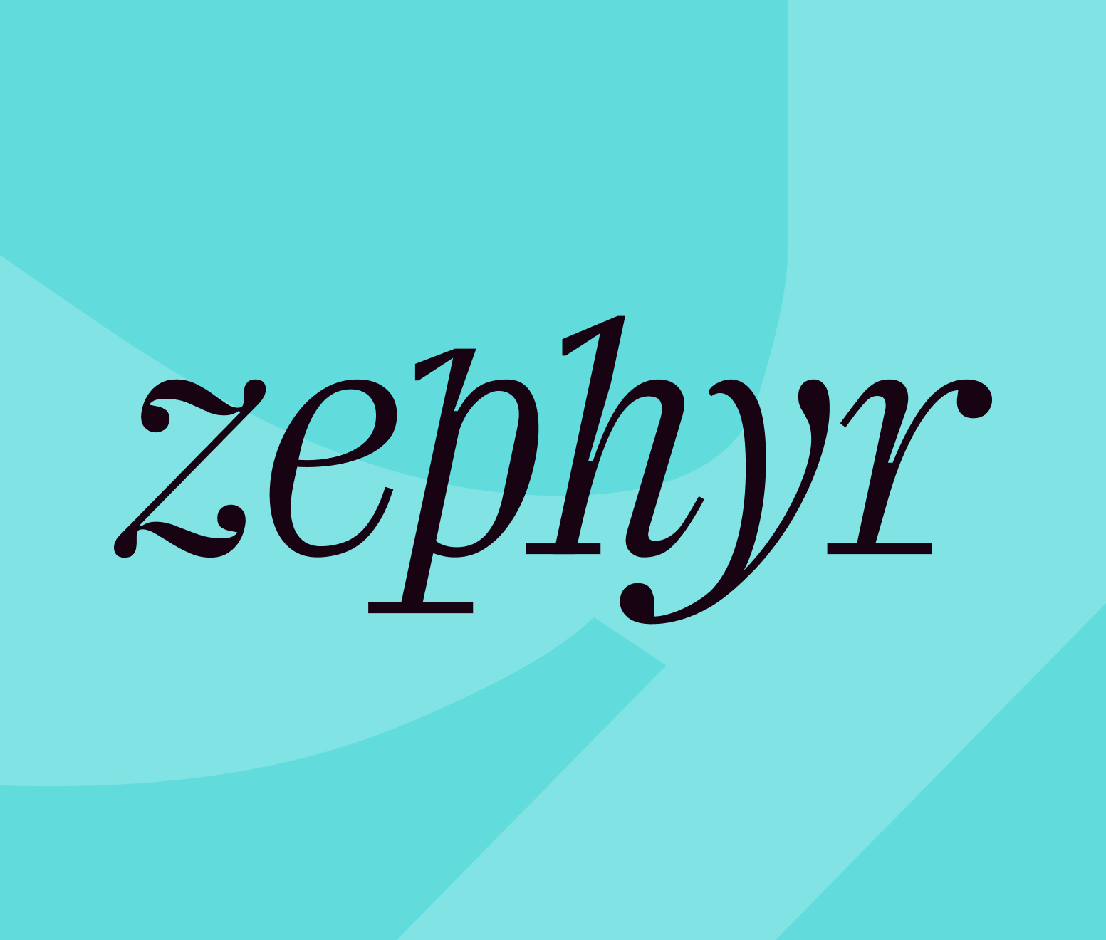


Zephyr
INDUSTRY
Lifestyle
YEAR
2025
SCOPE
Visual Identity Design
Zephyr
The premium DTC bedding market is built on sameness. Thread counts, certifications, natural materials, and a muted visual language that signals quality without warmth. Brands in this space speak to the head of a considered buyer. Zephyr was conceived to speak to the heart instead. A fictional brand built around a single idea: coziness as an emotional constant, not a seasonal purchase.
【 1 / 5 】
Challenge
The premium DTC bedding market has matured into a sea of sameness. Thread counts, certifications, natural materials, and a muted visual language that signals quality without warmth. They speak to the head of a considered buyer. But nobody is speaking to the heart. For adults in their early thirties navigating demanding careers and the complexity of modern life, a bed isn't just a purchase. It's a refuge.
Zephyr was built to own that territory. Not another premium bedding brand competing on craft and heritage, but the first one to make coziness itself the product.
【 2 / 5 】
Strategy
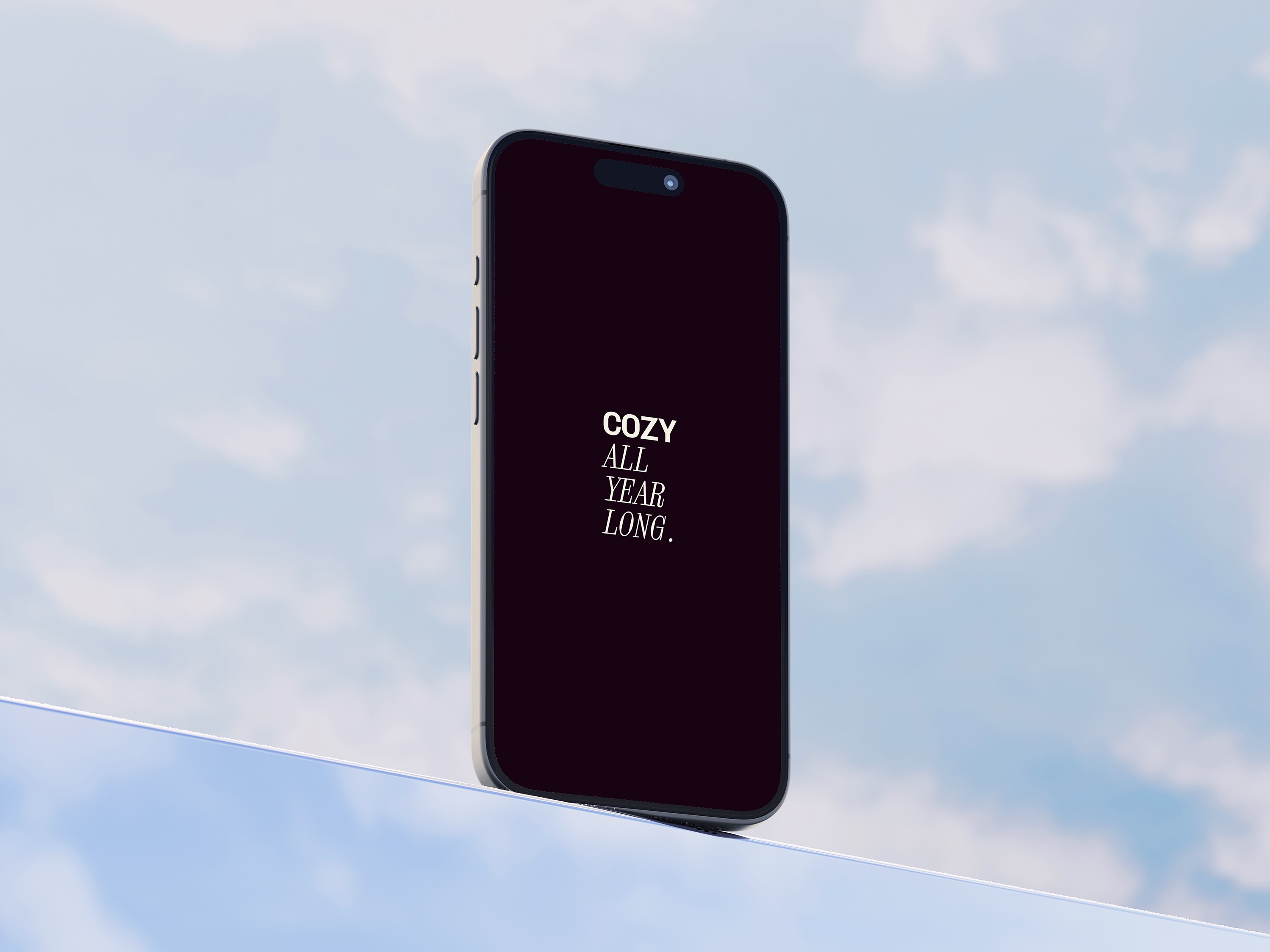
Most premium bedding brands earn trust through what they make. Zephyr earns it through how it makes you feel. The brand idea “Cozy all year long” reframes the product as an emotional constant rather than a seasonal purchase or a considered investment. Coziness is universal and timeless: it doesn't belong to winter, to sleep, or to any particular moment. It belongs to anyone who needs a refuge. That idea shaped every identity decision. Warmth over coolness. Softness over precision. A visual language that feels like an exhale.
Brand Keywords


【 3 / 5 】
Identity
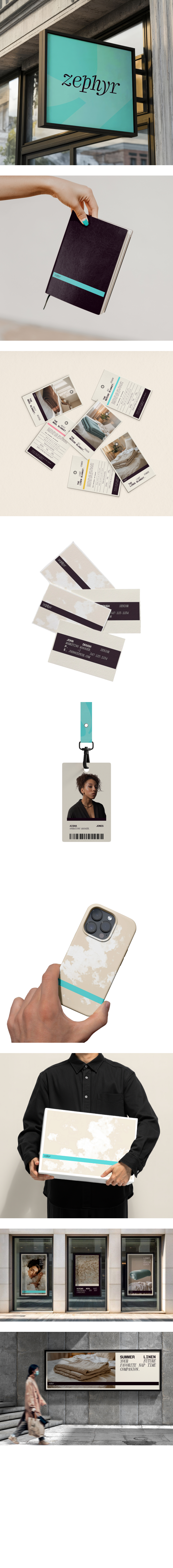
Zephyr's visual language is built around a single sensation: weightlessness. Cloud imagery anchors the brand idea made tangible: the softness and warmth of a blanket translated into form. A neutral warm palette avoids the cool minimalism typical of the category. Typography leans into legibility and quiet confidence. A recurring horizontal stroke runs through every touchpoint, anchoring the lightness in place.


【 4 / 5 】
Application
The identity was applied across packaging, labels, e-commerce, and social media — contexts that each demand something different from a visual system.
On packaging and labels, the utilitarian clarity and horizontal stroke bring structure to the physical product.
On e-commerce and social, the warm palette and cloud imagery carry the emotional weight, turning every touchpoint into a small reminder of what the brand promises.
【 5 / 5 】
Outcome
Zephyr is a proof of concept for emotion-led brand building in a category that has long prioritized material credentials over feeling. It demonstrates that premium doesn't have to mean cold. Warmth, lightness, and universality can coexist with craft and confidence.
Photography was generated using Visual Electric, exploring how AI tooling can serve a defined brand world rather than replace the thinking behind it.
Zephyr
INDUSTRY
Lifestyle
YEAR
2025
SCOPE
Visual Identity Design