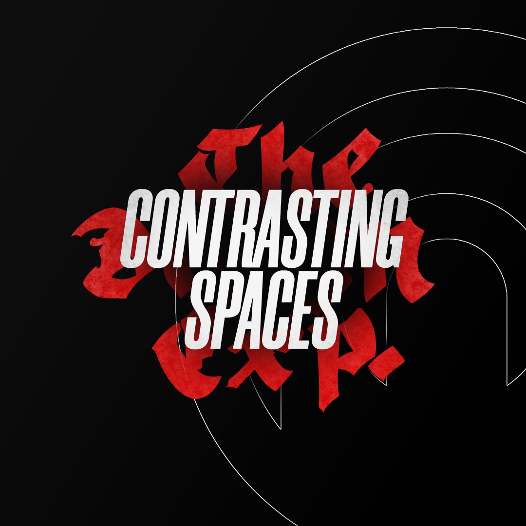
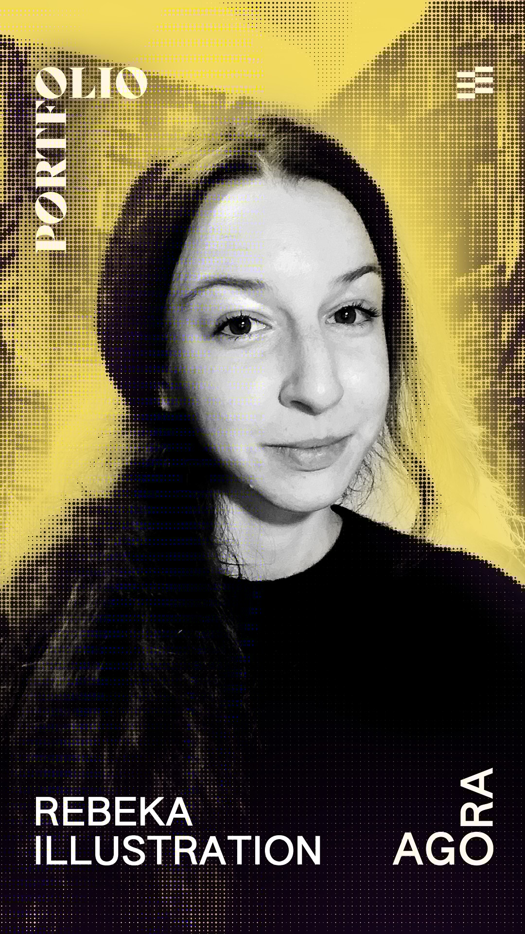
AGORA Magazine
AGORA Magazine was a digital creative magazine I founded and led in Prague, supported by Prague City University. Over two years and four issues, it grew from an editorial experiment into a platform with genuine creative ambition, featuring collaborations with international creatives and studios. The original identity served its purpose but had outgrown the project it was representing.
Brand Keywords


Neutral
dark
Neutral
Light
Accent

AGORA Magazine
INDUSTRY
Publishing
YEAR
2020 – 22
SCOPE
art direction • visual identity design • Editorial design • Brand design • web development
CREDITS
Kateřina Erteltová, Tamta Mamatelashvili
Editorial design
Monica Mills, Mirna Kovach, Paul DeLave
Editorial & proofreading
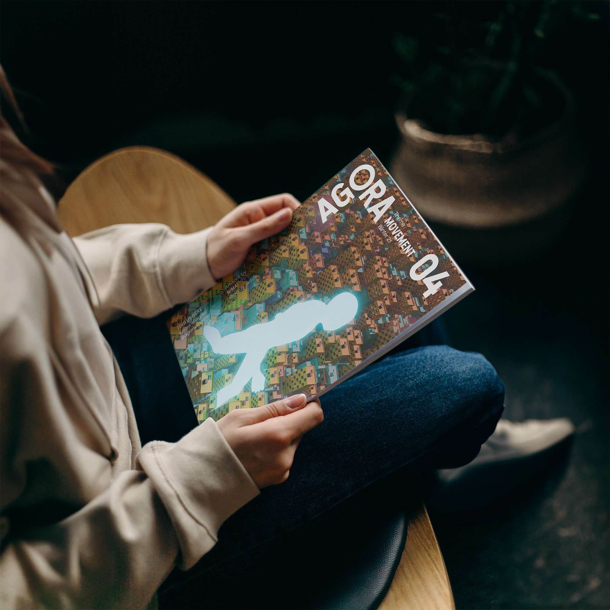
Natália Parišová, Chang Ee, William Thomy, Nimai Jaswal
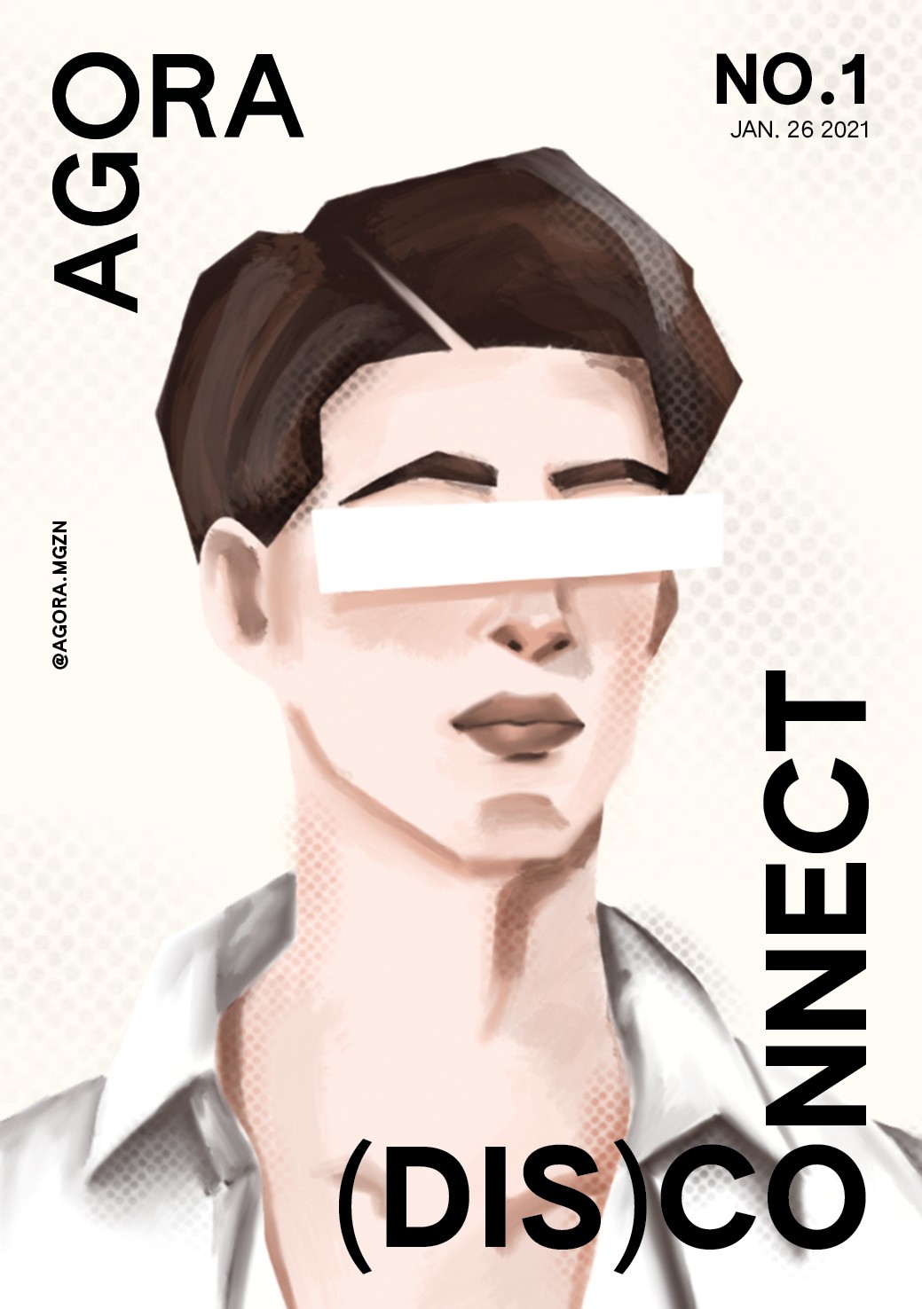
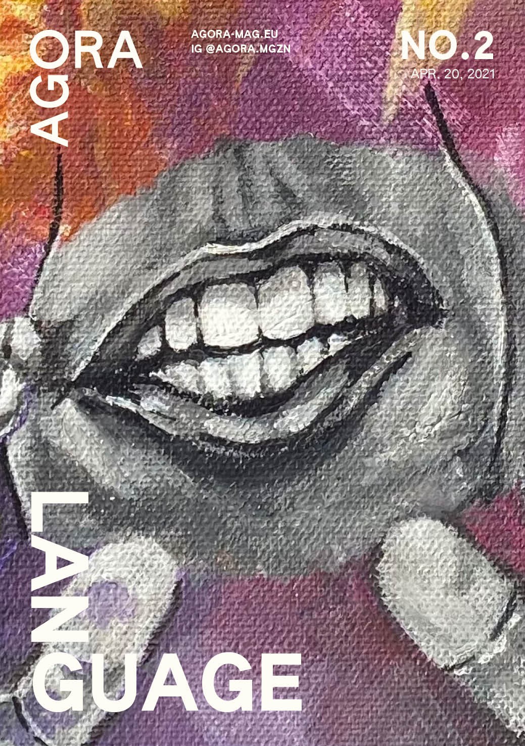
Cover artworks
AGORA Magazine
AGORA Magazine was a digital creative magazine I founded and led in Prague, supported by Prague City University. Over two years and four issues, it grew from an editorial experiment into a platform with genuine creative ambition, featuring collaborations with international creatives and studios. The original identity served its purpose but had outgrown the project it was representing.
【 1 / 5 】
Challenge
During our first year of production, I prioritized exploring mediums and testing out ideas. Breaking things to see what sticks. By the end of the year, it was clear the magazine needed a stronger foundation: a brand flexible enough to coexist with a wide variety of art styles without losing its own voice.
I used the summer break to rebuild it.
【 2 / 5 】
Strategy
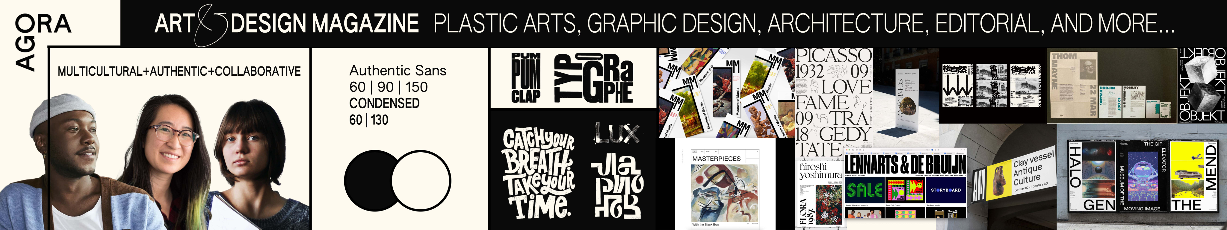
The magazine is a catalyst for creativity. It balances hosting many voices, cultures and experiences with its own.
Urban, multicultural and authentic, AGORA is unapologetically creative.
Brand Keywords


【 3 / 5 】
Identity
As a Prague-based magazine, I used local design vernacular to build the identity. It is still to this day influenced by post-soviet style that features brutalist typography. Type-heavy, high contrast and uncompromising.
I softened its sharpness with a rounded typeface, creating a tension between rigor and warmth that felt true to a magazine built by a community of internationals navigating the same city.
Neutral
dark
Neutral
Light
Accent
【 4 / 5 】
Application
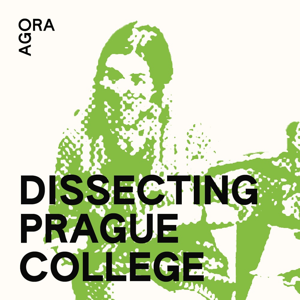
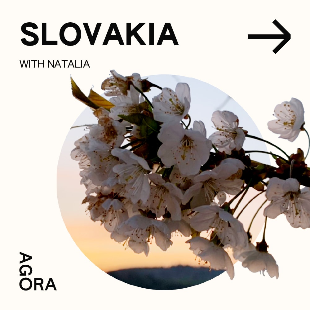
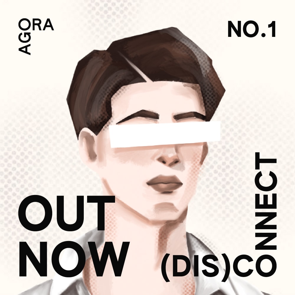
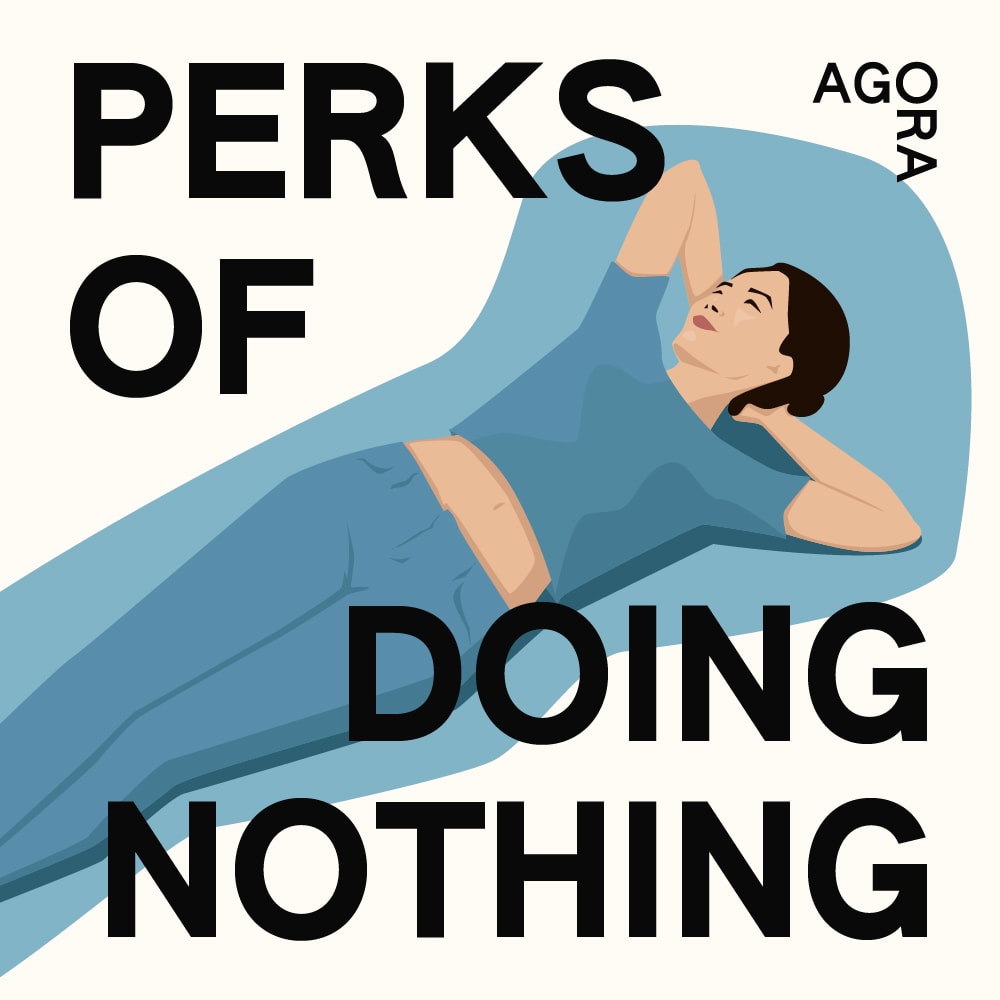
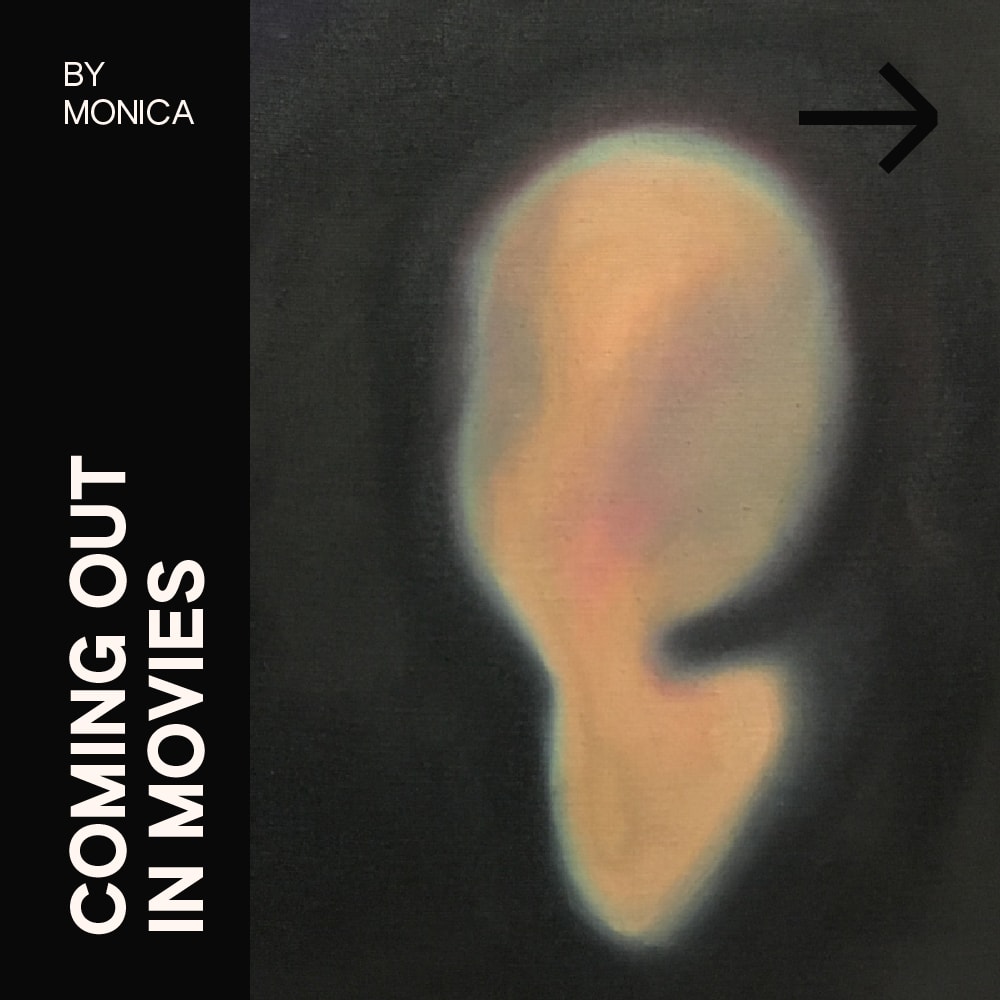
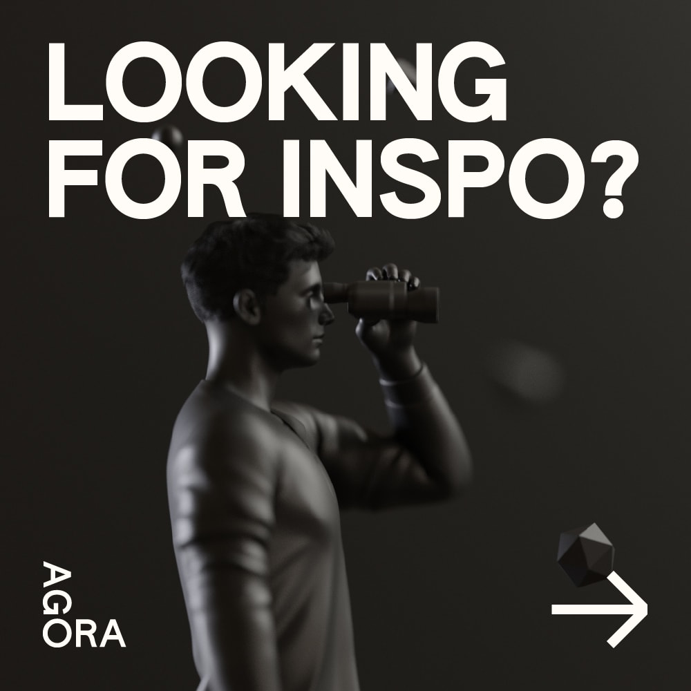
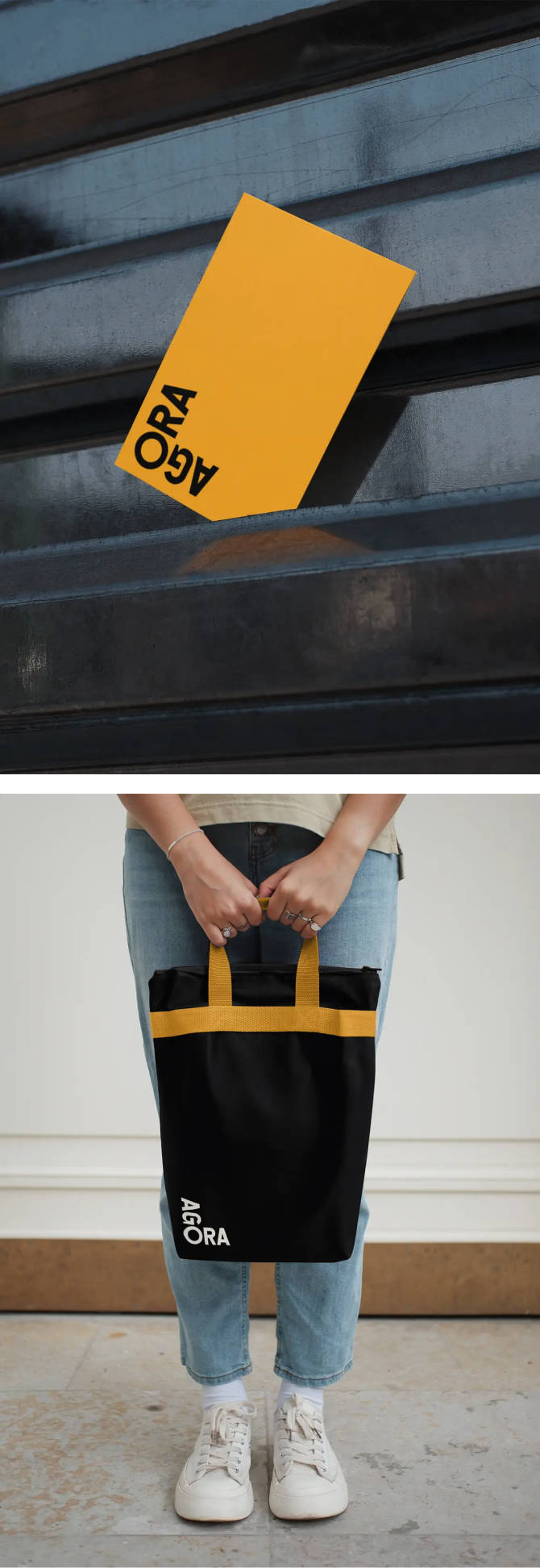
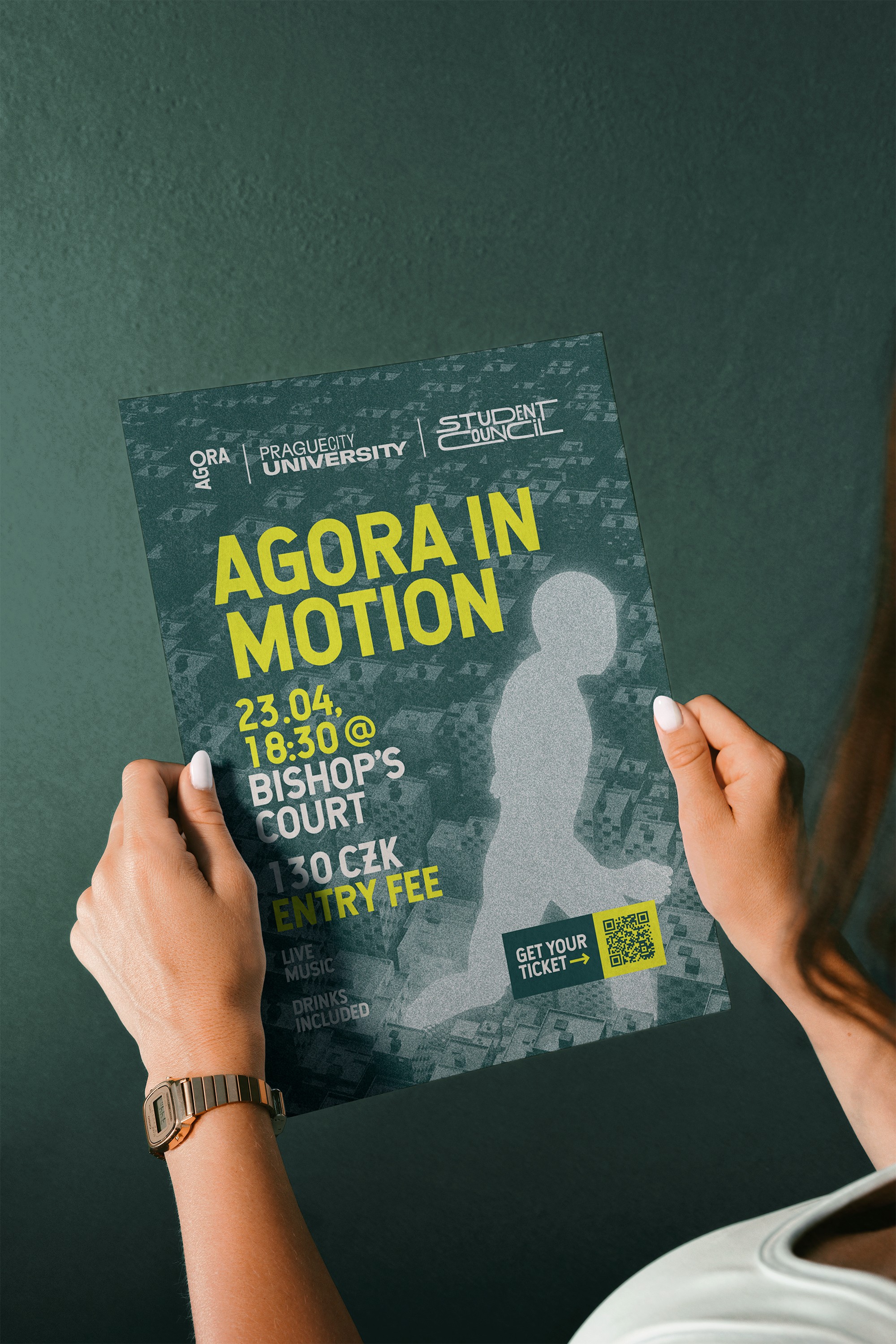
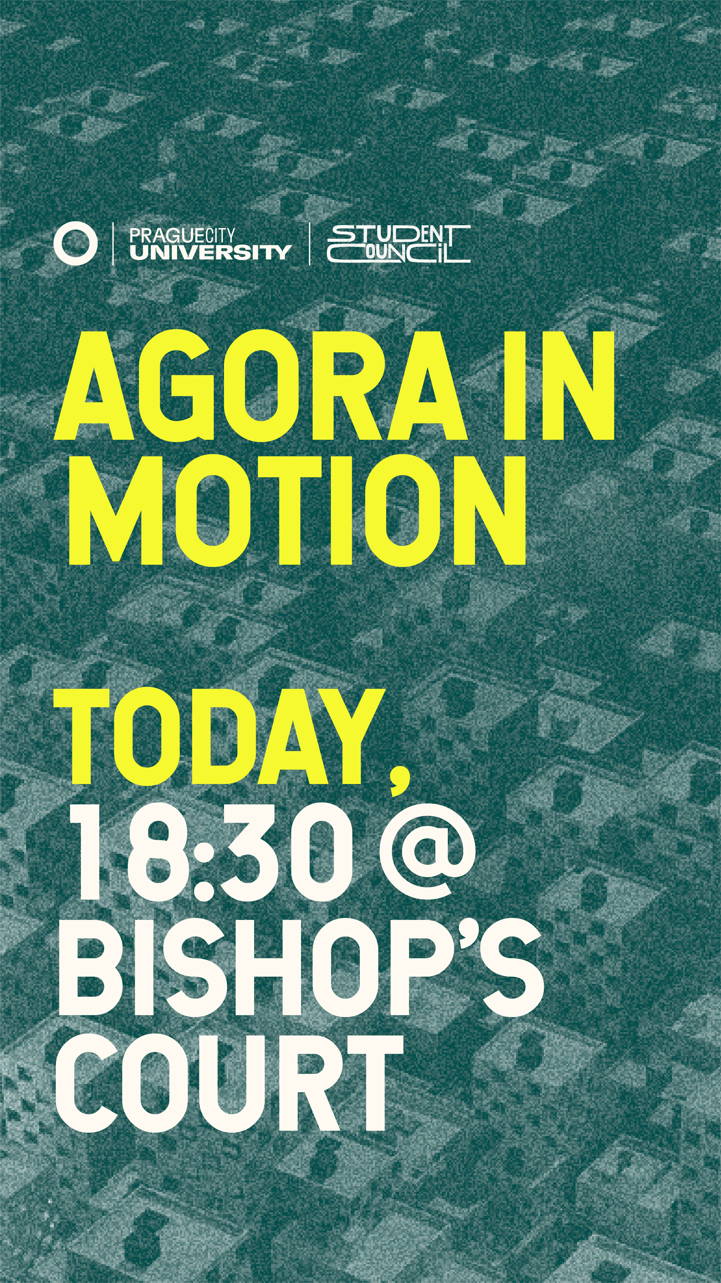
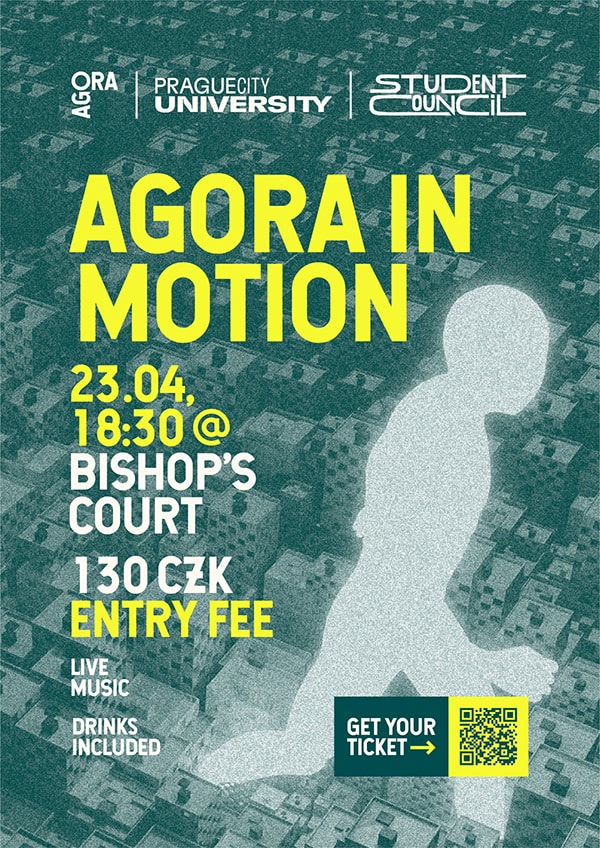
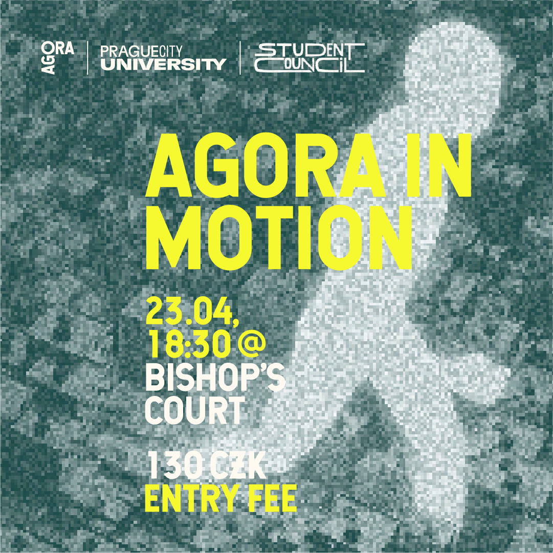
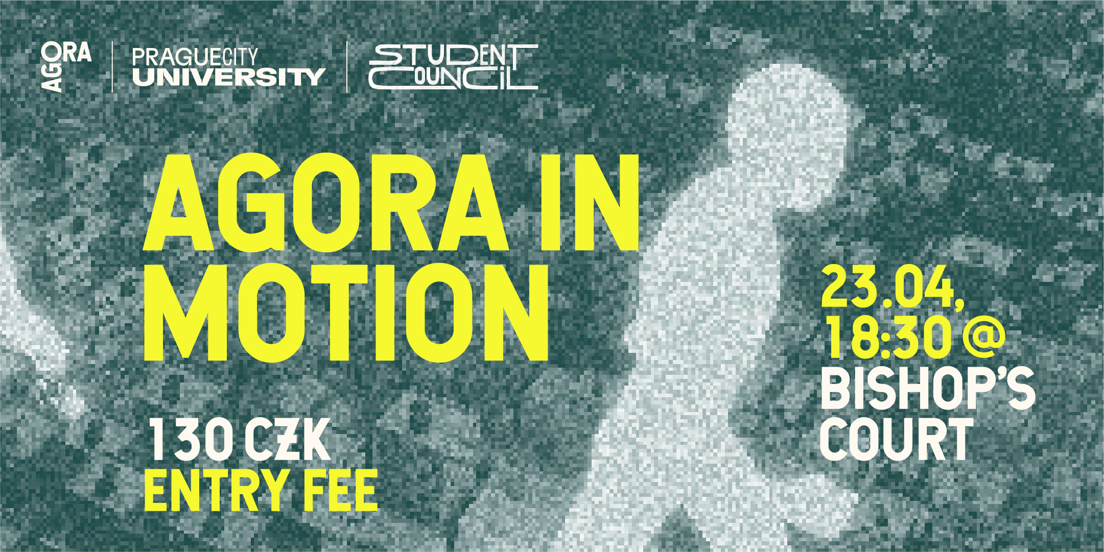
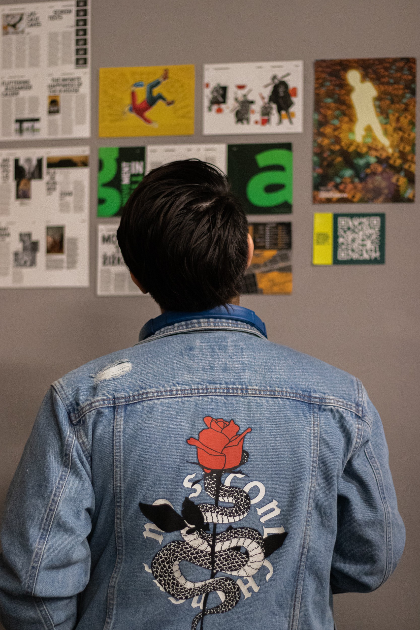
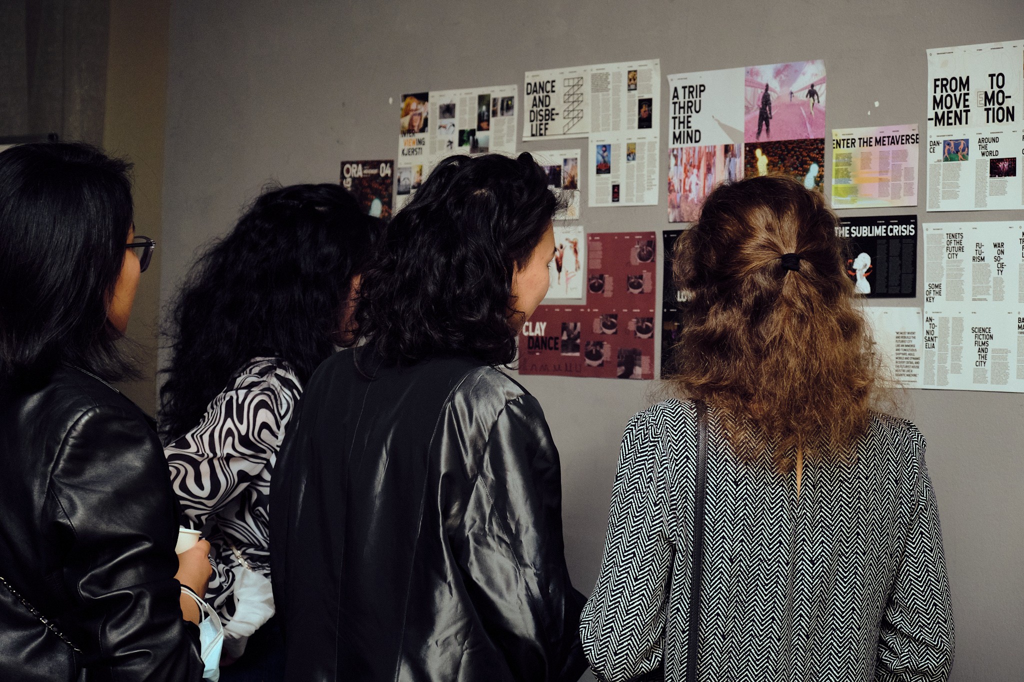
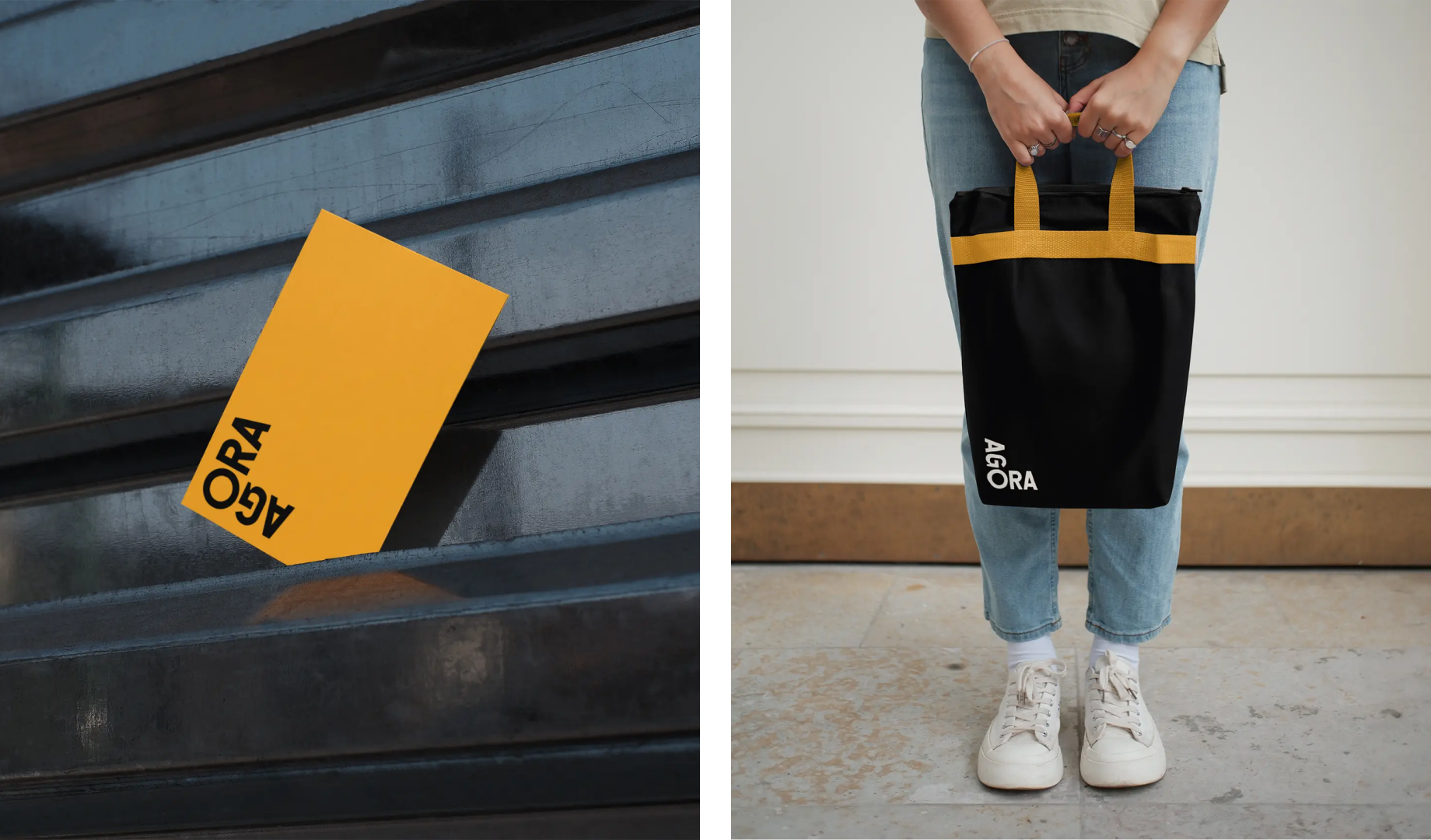
The identity was built to recede when it needed to. Covers, editorial spreads, and social content all use the circular O as a visual anchor and condensed stacked typography as the structural frame. Within that, contributors had room to bring their own visual voice.
The same system extended to event materials and the website, consistent enough to be recognizable, open enough to never feel repetitive.


【 5 / 5 】
Outcome
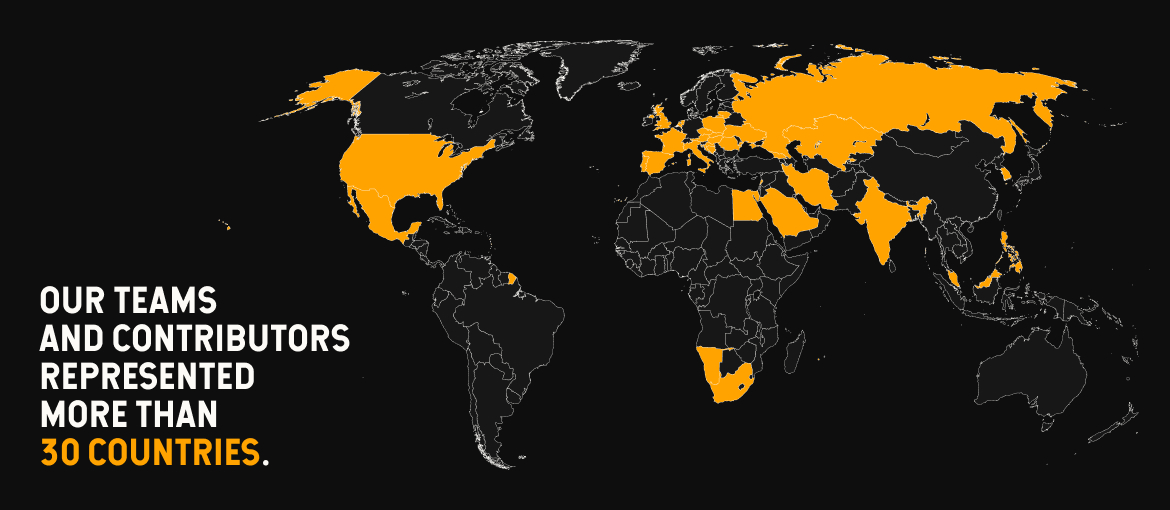
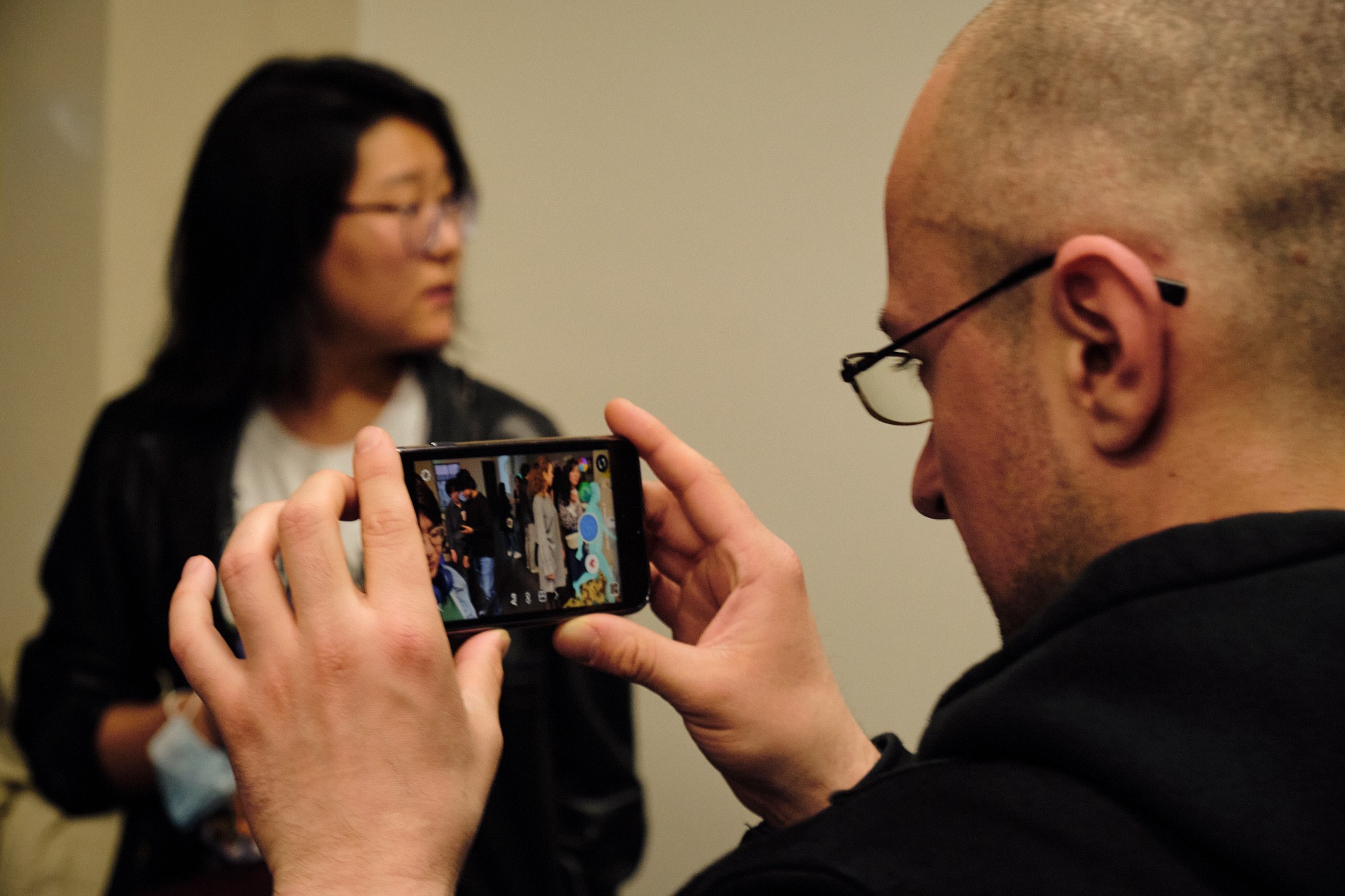
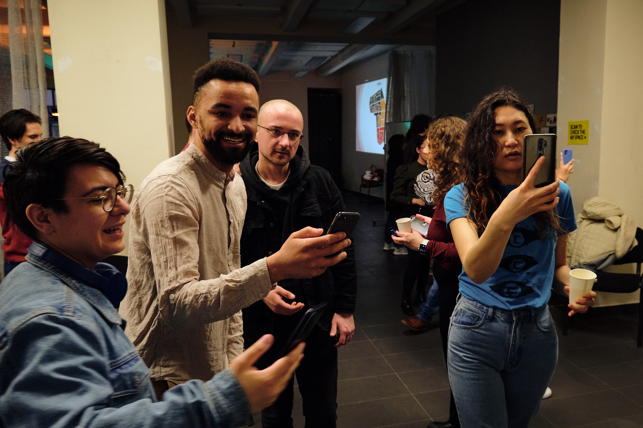
The rebrand made AGORA legible enough to grow. Contributors from across Europe, Asia, and Africa began reaching out organically, bringing fresh perspectives to issues 3 and 4.
The increased volume of creative collaborators led to recruiting 2 junior designers to support production. In year two, we ramped up editorial output to 70+ website articles.
The brand had become credible enough to attract the community it was built around.
AGORA Magazine
INDUSTRY
Publishing
YEAR
2020 – 22
SCOPE
art direction • visual identity design • Editorial design • Brand design • web development
CREDITS
Kateřina Erteltová, Tamta Mamatelashvili
Editorial design
Monica Mills, Mirna Kovach, Paul DeLave
Editorial & proofreading
Natália Parišová, Chang Ee, William Thomy, Nimai Jaswal
Cover artworks